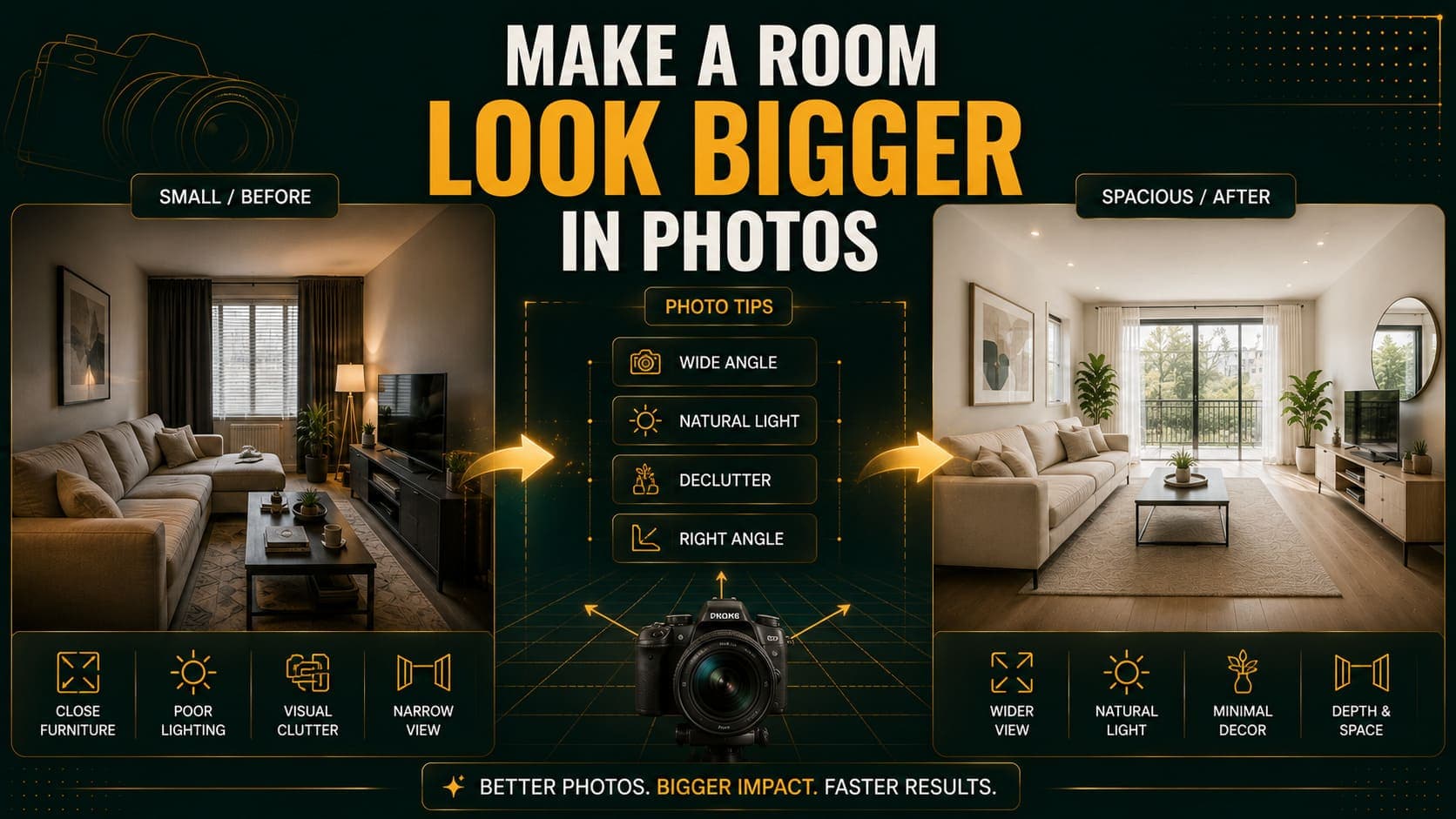
There are two ways to make a room look bigger in photographs. One works and the other creates problems at the viewing.
The approach that works: show the room accurately, from the position and with the lighting that presents it best.
The approach that backfires: distort the geometry with extreme wide-angle so the room appears larger than it is. Buyers arrive, find a room noticeably smaller than expected, and the mismatch costs you more than the extra clicks gained.
This covers the first approach.
The Single Biggest Factor: Camera Position
Stand in a Corner
Shooting from a corner, facing diagonally across the room, captures two walls and the maximum amount of floor.
Shooting from the middle of a wall captures one wall and a narrow strip of floor.
The same room photographed both ways looks substantially different in size. This is free, takes no equipment, and is the highest-impact change most people can make.
Which Corner
Choose the corner furthest from the window. Shooting with the light rather than into it produces better exposure and avoids the room falling into shadow.
If there are two candidate corners, shoot both and compare. Rooms often photograph noticeably better from one than the other.
Camera Height
Chest height — roughly 1.2 metres.
Lower makes the floor dominate and the ceiling loom. Higher compresses the floor, which makes the room read as smaller.
Chest height matches how people naturally perceive interior space, which is why it reads as accurate.
Try DecoAI Free
3 free credits. No credit card needed. Stage any room in 30 seconds.
Get 3 Free CreditsLens Choice
Use Moderate Wide-Angle
0.5x on most phones captures more of the room without breaking geometry.
This is genuinely helpful and not deceptive — it approximates human peripheral vision better than a standard lens does.
Avoid Extreme Wide-Angle
Clip-on fisheye lenses and very wide focal lengths produce visible distortion: walls curve, furniture at the frame edges stretches, and proportions become implausible.
Two problems with this:
- Buyers notice. Distorted property photos have a recognizable look, and experienced buyers discount them.
- The viewing disappoints. A room that looked 30% larger in photos than it is produces a negative reaction that's hard to recover from.
Keep the Camera Level
Tilt makes vertical lines converge, which reads as distortion even when the lens is fine.
Turn on your phone's grid or level indicator and keep it aligned.
Lighting
Maximize Every Light Source
Open all curtains and blinds fully. Natural light makes rooms look larger. Partially closed coverings make them look dim and smaller.
Turn on every light, including lamps and under-cabinet strips. Interior lights fill the shadow corners that windows don't reach.
Shoot between 10am and 2pm. Even light, short shadows, and the most natural colour rendering.
Don't use flash. It produces flat light with hard shadows behind furniture, which makes rooms look smaller and more cramped.
Why Light Affects Perceived Size
Dark corners read as boundaries. When a room's corners are well lit, the eye reads the full extent of the space. When they're in shadow, the eye stops at the shadow line and the room appears to end there.
Room Preparation
Empty It Completely
If you're staging digitally, this is required anyway. If you're photographing as-is, remove everything portable.
Every object occupies visual space. A room with five objects reads as smaller than the same room with none.
Clear the Floor Above All
Visible floor is what makes rooms look large. Anything on the floor — boxes, bins, bags, small furniture — reduces the visible floor area and directly reduces perceived size.
Clean the Windows
Clean windows admit more light and read as brighter. Dirty ones produce a subtle haze that flattens the image.
Staging Choices That Help
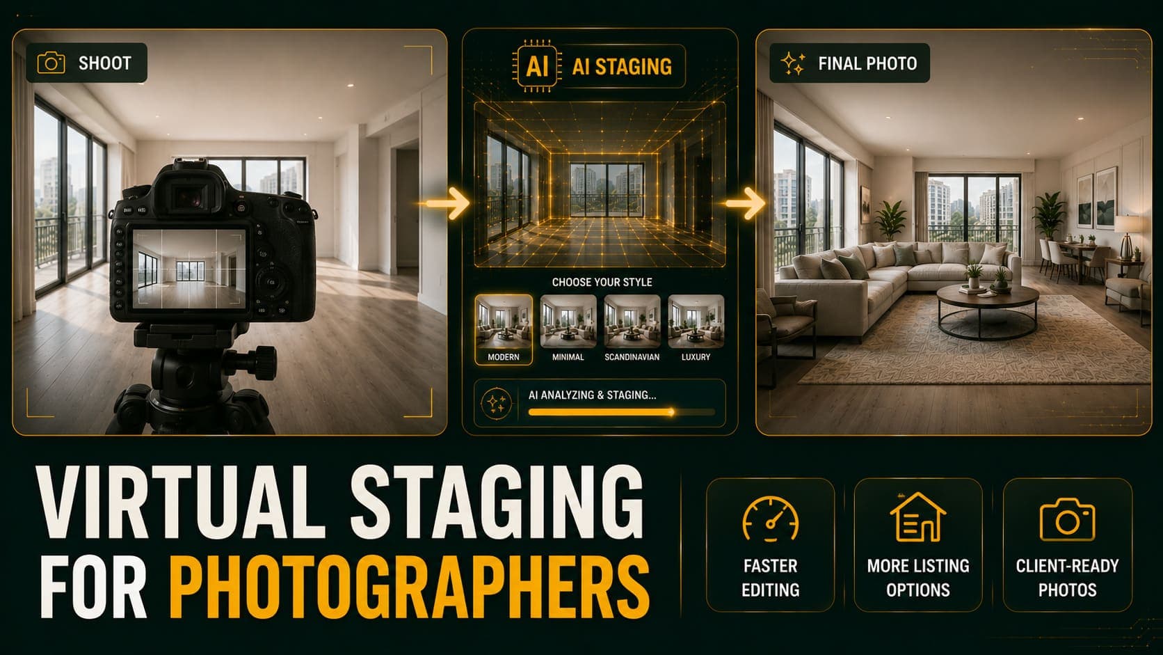
If you're staging digitally, these decisions affect perceived size significantly.
Choose Light Styles
Scandinavian and Minimalist both use pale palettes and slim furniture, which maximizes visible floor and reflected light.
Avoid Traditional, Industrial, and Luxury in small rooms — darker palettes and fuller furniture both work against perceived size.
Scale Furniture Down
Show a loveseat rather than a three-seat sofa. A double bed rather than a queen. A small round table rather than a large rectangular one.
Undersized furniture in a small room leaves visible floor. Correctly sized furniture fills it.
Choose Furniture with Visible Legs
A sofa on slim legs shows floor beneath it. A sofa with a solid base to the ground blocks it entirely.
This single characteristic makes a noticeable difference and costs nothing to specify.
Keep Furniture Low
Low-backed sofas and platform beds leave more visible wall above them, which makes ceilings feel higher.
Use Fewer Pieces
Three well-chosen items read as intentional and leave floor visible. Six items fill the room.
Try DecoAI Free
3 free credits. No credit card needed. Stage any room in 30 seconds.
Get 3 Free CreditsComposition Details
Include a Doorway or Corner
An image showing two walls meeting, or a doorway into another space, creates depth. A flat wall-facing shot has none.
Show the Window
Windows communicate light and provide a visual escape from the room. An image with a window reads as more open than one without.
Avoid Cropping Tightly
Cropping in to fill the frame with furniture makes rooms look smaller. Include the floor and ceiling edges where possible.
Shoot Multiple Angles
Rooms often photograph better from one position than another, and it's not always predictable. Two or three angles per room, then pick the strongest.
What Doesn't Work
Extreme Wide-Angle
Covered above. Gains clicks, loses at viewing.
Removing Walls or Extending Rooms Digitally
Beyond distortion — this is misrepresentation, and it's immediately apparent at viewing.
Over-Brightening in Editing
Pushing exposure too far washes out detail and produces a flat, unnatural image. Buyers register that something's off even if they can't identify it.
Mirrors Positioned to Fake Depth
An old trick that rarely fools anyone in photographs and reads as manipulative.
Shooting from Outside the Room
Standing in the hallway and shooting through a doorway makes the room look larger by including the doorway frame. It also tells buyers nothing about what the room is actually like.
Room-Specific Notes
Small Living Rooms
Corner shot, loveseat-scale staging, light palette, all lights on. Keep floor visible.
Small Bedrooms
Shoot from the corner diagonally opposite the bed wall. Stage a double rather than a queen. Ensure visible floor on both sides of the bed.
Small Kitchens
Shoot from the doorway down the length. Clear every counter completely — visible worktop is the equivalent of visible floor here.
Small Bathrooms
Shoot from the doorway. Remove everything. Check what the mirror reflects. These photograph poorly regardless, so keep it clean and simple rather than trying to make it look large.
Studios
Shoot from the corner that shows the most of the space. Stage minimally — Minimalist or Scandinavian. Show the layout clearly rather than trying to disguise that it's one room.
Frequently Asked Questions
How do I make a small room look bigger in photos?
Shoot from a corner at chest height with a level camera, maximize all light sources, clear the room completely, and use light-palette staging with slim furniture.
Should I use a wide-angle lens for property photos?
Moderate wide-angle — 0.5x on most phones — helps and isn't deceptive. Extreme fisheye distorts geometry noticeably and disappoints buyers at viewing.
Why do my rooms look small in photos?
Most commonly: shooting from the middle of a wall rather than a corner, poor lighting, and objects left in the room reducing visible floor.
Does staging make rooms look bigger?
The right staging does. Light palettes, slim furniture with visible legs, and fewer pieces all increase visible floor and perceived size. Heavy furniture in dark tones does the opposite.
What's the best camera height for property photos?
Chest height, roughly 1.2 metres. Lower exaggerates the floor; higher compresses it.
Should I include the ceiling in the shot?
Partially. Showing where wall meets ceiling gives the eye a boundary and communicates ceiling height. Excluding it entirely can make rooms feel compressed.
Do mirrors make rooms look bigger in photos?
In person, somewhat. In photographs, rarely — and mirrors positioned specifically to fake depth read as manipulative.
Is it dishonest to make rooms look bigger?
Not if you're presenting the room accurately from its best angle with good lighting. It becomes dishonest when distortion makes the room appear materially different from reality.
Which staging style makes rooms look largest?
Scandinavian or Minimalist. Both use pale palettes and restrained furniture, maximizing visible floor and reflected light.
Summary
The highest-impact changes, in order:
- Shoot from a corner rather than a wall
- Turn on every light and open every curtain
- Clear the room completely
- Camera at chest height, level
- Moderate wide-angle, not fisheye
- Light-palette staging with slim furniture
What to avoid: Extreme wide-angle distortion, heavy over-editing, and anything that makes the room appear materially different from reality.
The test: would a buyer walking into this room be surprised by its size? If yes, the photograph is doing too much work.
Stage small rooms to show more floor. DecoAI gives 3 free credits with no card required — enough to compare Scandinavian and Minimalist staging and see which makes your room read largest.