Interior Design Trends 2026: What to Use in Staging and What to Skip
Design trends and staging trends aren't the same thing. A trend can dominate design media and still be a poor staging choice — because staging has a different job than decorating.
Staging needs to appeal broadly, photograph well, and not date within the listing period. Decorating can be personal, textured, and current in a way staging can't afford.
This assesses the 2026 trends on those terms: what to use, what to use sparingly, and what to skip entirely.
The Trends Worth Using
Warm Neutrals Over Cool Greys
The dominant palette shift of the past few years, and now firmly established.
What it means: Greige, mushroom, warm beige, and cream have replaced the cool blue-grey that dominated the 2010s.
Why it works for staging: Warm neutrals photograph better in varied lighting conditions and read as more welcoming. Cool grey now looks distinctly dated, which is a real problem in listing photos.
Staging application: Default to warm neutrals in Contemporary and Modern staging. If your tool offers palette control, avoid anything with a blue undertone.
Curved and Softened Forms
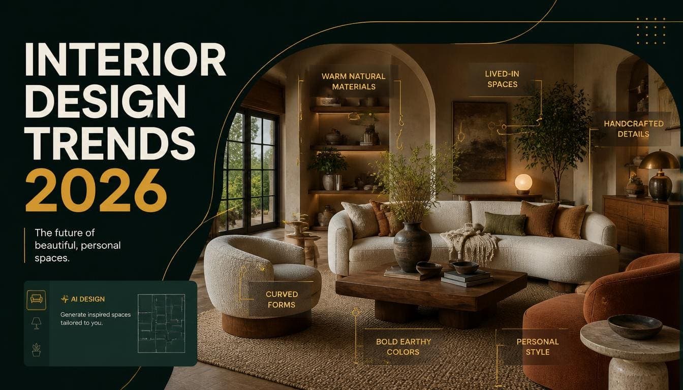
Sharp geometry has given way to rounded edges — curved sofa arms, arched mirrors, oval tables, softened corners.
Why it works for staging: Curves read as comfortable rather than austere, which helps in family and suburban markets where warmth matters.
Staging application: Contemporary staging already incorporates this. It's a genuine improvement over the harder Modern aesthetic for most residential properties.
The caution: heavily curved statement furniture can date. Subtle softening is safer than dramatic curves.
Try DecoAI Free
3 free credits. No credit card needed. Stage any room in 30 seconds.
Get 3 Free CreditsTexture Over Pattern
Visual interest carried by material rather than print — bouclé upholstery, ribbed and fluted surfaces, chunky knits, natural stone with visible veining.
Why it works for staging: Texture adds depth without the divisiveness of pattern. A bouclé sofa appeals more broadly than a patterned one.
Staging application: Excellent. Textured neutrals give images visual interest while remaining broadly appealing.
Natural Materials
Wood, stone, rattan, linen, wool — used honestly rather than imitated.
Why it works for staging: Reads as quality and warmth simultaneously. Photographs well.
Staging application: Central to Scandinavian and Contemporary staging already. Worth emphasizing.
Travertine and Warm Stone
Travertine specifically has become prominent — in coffee tables, side tables, and surfaces.
Why it works for staging: Warm-toned stone reads as premium without the coldness of marble or the ubiquity of quartz.
Staging application: Good for Contemporary and Luxury staging. A travertine coffee table reads as considered.
Sculptural Lighting
Lighting treated as a design object — oversized pendants, sculptural floor lamps, statement fixtures.
Why it works for staging: A distinctive light fixture gives an image a focal point. It also signals that the space has been thought about.
Staging application: Particularly effective over dining tables, where a pendant defines the zone and provides visual interest.
The Trends to Use Sparingly
Deep Saturated Colour
Emerald, navy, burgundy, and forest green as base colours rather than accents.
Why it's risky for staging: Deep colours need good natural light to read as rich rather than gloomy. They also divide opinion more than neutrals.
Where it works: Premium properties with strong light, dining rooms, and home offices where drama is appropriate.
Where it doesn't: Small rooms, dim rooms, and anything where broad appeal matters more than distinctiveness.
Fluted and Ribbed Surfaces
Vertical fluting on cabinet fronts, island sides, and furniture.
Why it's risky: Currently very prominent, which means it will read as "2020s" within a few years. That matters less for a listing than for a renovation, but it's worth knowing.
Where it works: Kitchen islands and single accent pieces.
Where it doesn't: Everywhere at once. Fluting on cabinets, furniture, and walls simultaneously is too much.
Statement Arches
Arched doorways, arched mirrors, arched headboards.
Why it's risky: Strongly identified with the current moment. Also architecturally fixed if built rather than furnished.
Where it works: An arched mirror is a low-commitment way to reference the trend.
Where it doesn't: As a dominant motif throughout a property.
Bold Colour Drenching
Painting walls, trim, ceiling, and sometimes furniture in a single deep colour.
Why it's risky for staging: Highly divisive. It's a decorating choice that expresses personality, which is the opposite of what staging is for.
Where it works: Almost nowhere in staging. It's a homeowner trend, not a marketing one.
Try DecoAI Free
3 free credits. No credit card needed. Stage any room in 30 seconds.
Get 3 Free CreditsThe Trends to Skip in Staging
Maximalism
Layered pattern, dense decoration, gallery walls, collected objects.
Why to skip: Staging works by helping buyers imagine their own life in a space. Maximalism fills that space with someone else's taste.
Bohemian staging touches this territory and works in specific markets — vacation rentals, creative urban areas. Full maximalism doesn't work anywhere in property marketing.
Heavily Themed Rooms
Themed children's rooms, home cinemas with dedicated decor, hobby rooms with specialist fittings.
Why to skip: Narrows the appeal to buyers who share that specific use. A neutral spare room reads as flexible; a themed one reads as a room they'd need to change.
Very Trend-Specific Furniture
Furniture that will be immediately datable — anything that reads as unmistakably "2026."
Why to skip: Listings can run for months. Staging that dates during the listing period works against you.
Practical guidance: choose furniture shapes that would have looked acceptable five years ago and probably will in five more. Softened Contemporary passes this test; strongly trend-driven pieces don't.
Dark and Moody Palettes
Charcoal walls, black kitchens, deep greens throughout.
Why to skip: Dark palettes absorb light and make rooms look smaller in photographs. They also require good natural light to work at all.
The exception: Industrial staging in properties with genuine industrial architecture, and single-room applications in premium properties with strong light.
The Colour Question
What's Current in 2026
Walls: Warm white, greige, soft mushroom Upholstery: Oatmeal, taupe, warm grey, soft clay Accents: Terracotta, sage, dusty blue, muted ochre Wood: Warm mid-tone oak and ash Metals: Brushed brass, matte black
What's Dated
Cool blue-grey — The defining neutral of the 2010s. Now reads as clearly of that period.
Chrome and high polish — Reads as commercial rather than residential.
Greige with a green undertone — Briefly popular, now looks slightly off.
All-white with no warmth — Reads as clinical rather than clean.
The Staging Rule for Colour
Neutral base, one or two muted accents. That combination has worked across every trend cycle because it lets buyers project their own preferences onto the space.
How to Apply Trends Without Dating
The Five-Year Test
Would this look acceptable five years ago, and will it probably look acceptable in five more?
Warm neutrals pass. Curved sofas pass. Fluted everything doesn't. Colour drenching doesn't.
Use Trends in Accessories, Not Structure
A travertine side table, a brass lamp, a bouclé cushion. These reference current design without committing the whole image to it.
Match the Trend Level to the Property
New builds can carry more current styling — buyers expect it.
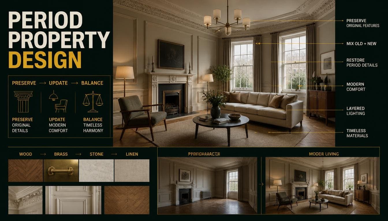
Period properties are better served by Traditional or Transitional staging that respects the architecture.
Mid-market suburban properties do best with Contemporary staging that reads as current but not fashionable.
Prioritize Photographing Well Over Being Current
A staging style that photographs well and reads as broadly appealing beats one that's precisely on-trend but produces a flatter or more divisive image.
What This Means for Style Selection
Mapping the 2026 trends onto the standard staging styles:
| Style | 2026 alignment | Staging verdict |
|---|---|---|
| Contemporary | Strong — it is current design | Best default for most properties |
| Scandinavian | Strong — warm neutrals, texture, natural materials | Best for small and dim rooms |
| Modern | Moderate — sharper than current trends | Good for urban and new builds |
| Traditional | Low — but Transitional version works | Good for period and family markets |
| Luxury | Moderate — deep colour is current | Premium properties only |
| Minimalist | Low — texture-light for current taste | Very small spaces only |
| Industrial | Low — dark palettes are out of favour | Warehouse conversions only |
| Bohemian | Moderate — natural materials align | Vacation rentals and creative markets |
The practical conclusion: Contemporary and Scandinavian align most closely with 2026 design without being trend-specific enough to date quickly. For most properties, they're the strongest choices.
Frequently Asked Questions
What are the main interior design trends in 2026?
Warm neutrals replacing cool greys, curved and softened forms, texture over pattern, natural materials, travertine and warm stone, and sculptural lighting.
Which trends work for property staging?
Warm neutrals, curved forms, textured neutrals, and natural materials. All appeal broadly and photograph well.
Which trends should staging avoid?
Maximalism, colour drenching, dark moody palettes, heavily themed rooms, and any furniture that reads as unmistakably of this moment.
Is grey out of style?
Cool blue-grey reads as dated. Warm greige and mushroom tones have replaced it and are firmly current.
What colours are current for interiors in 2026?
Warm white, greige, and mushroom for walls. Oatmeal, taupe, and soft clay for upholstery. Terracotta, sage, dusty blue, and muted ochre as accents.
Should staging follow trends at all?
Partly. Staging that looks dated works against you. But staging that's precisely on-trend will date during the listing period. Aim for current-but-not-fashionable.
Which staging style is most current in 2026?
Contemporary, by definition — it means current design. Scandinavian aligns closely and works better in small or dim rooms.
Do trends matter more than photographing well?
No. A style that photographs well and appeals broadly beats one that's precisely on-trend but produces a flatter image.
How do I use trends without dating the staging?
In accessories rather than structure. A travertine table or a brass lamp references the moment; fluted cabinets and colour drenching commit to it.
Summary
Use: Warm neutrals, curved forms, texture over pattern, natural materials, sculptural lighting.
Use sparingly: Deep saturated colour, fluting, arches. All work as accents, not as dominant motifs.
Skip: Maximalism, colour drenching, dark moody palettes, themed rooms, and strongly trend-specific furniture.
The test that matters: would this look acceptable five years ago and probably in five more? If not, it will date during your listing period.
The safest current choices: Contemporary for most properties, Scandinavian for small or dim rooms. Both align with 2026 design without being fashionable enough to date.
Test current styling on your own room. DecoAI gives 3 free credits with no card required — enough to compare Contemporary against Scandinavian and see which suits your property.