Most rooms that feel wrong have the same handful of problems. They're not matters of taste — they're measurable errors that produce a consistent effect, and most cost very little to fix.
This lists them in order of how much they affect the result, with the fix and rough cost for each.
The Five That Matter Most
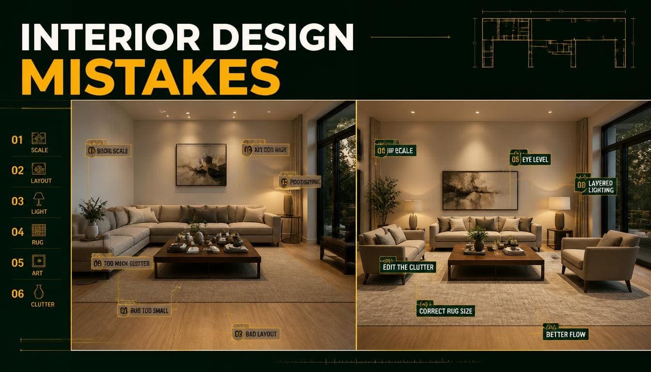
1. Furniture Pushed Against Every Wall
What it looks like: a hollow centre with a ring of furniture around the edges. The room reads as a waiting area.
Why it happens: the instinct that pushing furniture back creates more space.
Why it's wrong: visible floor behind furniture reads as depth. Furniture flush to the wall gives the eye nothing.
The fix: pull seating inward, even 15–20cm, into an inward-facing group.
Cost: free. Effect: the largest single change available in most rooms.
The exception: genuinely small rooms where clearance is already tight.
2. Single-Source Ceiling Lighting
What it looks like: flat light, hard shadows under furniture, dark corners.
Why it's wrong: even illumination means no shadow gradient, and shadow gradient is what gives rooms depth. Dark corners read as boundaries, making rooms look smaller.
The fix: add two lamps at different heights — a floor lamp and a table lamp.
Cost: $60–$150. Effect: larger than any other purchase at that price.
3. Undersized Rug
What it looks like: a rug floating in the middle with no furniture on it. The seating reads as scattered around an unrelated object.
The fix: a rug large enough that at least the front legs of all seating rest on it.
Cost: the difference between the wrong size and the right one. Effect: it's the element that connects a seating arrangement.
The rule: if the rug touches nothing, it's too small.
4. Art Hung Too High
What it looks like: pictures floating near the ceiling, disconnected from the furniture below.
Why it happens: aligning with furniture tops, using existing hooks, or overcompensating for high ceilings.
The fix: centre the artwork at 145–155cm from the floor. Above furniture, 15–25cm gap.
Cost: free. Effect: immediately visible, and it's the most common error in interior decoration.
5. Too Much Furniture
What it looks like: minimal visible floor, crowded circulation, and a room that feels smaller than its dimensions.
The fix: remove roughly a third. Extra chairs, side tables, and anything in corners.
Cost: free. Effect: perceived room size correlates with visible floor.
Try DecoAI Free
3 free credits. No credit card needed. Stage any room in 30 seconds.
Get 3 Free CreditsScale and Proportion Errors
6. Furniture Too Large for the Room
A three-seat sofa in a 12 m² living room fills the frame and leaves no visible floor.
The fix: scale down one size. Loveseat instead of three-seat. Double instead of queen. Small round table instead of large rectangular.
7. Furniture Too Small for the Room
Less common but equally visible. Small pieces in a generous room read as sparse rather than spacious.
The fix: fewer, larger pieces. Three substantial items beat six small ones.
8. Art Too Small for the Wall
A small piece on a large wall reads as tentative.
The fix: artwork should occupy roughly 60–75% of the available wall width. If a single piece isn't large enough, group several.
9. Mismatched Scale Between Pieces
A delicate chair beside a heavy sectional clashes. Style differences are fine; weight differences aren't.
The fix: match the visual weight of pieces even when their styles differ.
10. Curtains Too Short or Too Narrow
Curtains ending at the sill, or a rail the same width as the window so the curtains cover the glass when open.
The fix: floor length, rail 10–15cm above the frame or near the ceiling, extending 15–25cm each side, with fabric width 2× the rail.
Colour Errors
11. Too Many Accent Colours
Three or four accents at similar weight produces visual noise with no hierarchy.
The fix: one accent, maybe two if closely related. 60% dominant neutral, 30% secondary, 10% accent.
12. Ignoring the Fixed Elements
Choosing a cool grey palette in a room with warm oak flooring.
The fix: read the flooring, worktops, tiles, and brickwork first. They aren't changing; the palette has to work with them.
13. Mixing Warm and Cool
Beige walls with cool grey furniture. Warm wood with chrome fittings.
The fix: commit to one temperature. Warm suits most residential interiors.
14. Cool Grey in North-Facing Rooms
Cool natural light plus cool paint reads distinctly blue and unwelcoming.
The fix: warm greige or warm white in north-facing rooms.
15. All-White With No Texture
Photographs flat and reads as clinical rather than clean.
The fix: add material variation — wool, linen, visible wood grain. The palette can stay white; the surfaces shouldn't.
Try DecoAI Free
3 free credits. No credit card needed. Stage any room in 30 seconds.
Get 3 Free CreditsLayout Errors
16. Ignoring the Focal Point
Seating that faces nothing in particular feels arbitrary.
The fix: orient toward the fireplace, the main window, or the room's natural focus.
17. Blocking the Walkway
Furniture obstructing the route between doorways reads as impractical, even in a photograph.
The fix: 75cm minimum walkway, 90–110cm comfortable for main routes.
18. Seating Too Far Apart
Beyond 2.5m, seating stops reading as a conversation area and reads as furniture placed around a room's edges.
The fix: bring seating closer, or add a piece between to bridge the gap.
Consistency Errors
19. Mixing Styles Between Rooms
A Modern living room next to a Traditional bedroom reads as disjointed, even to people who can't identify why.
The fix: one style across the property. Consistency in palette, wood tones, and metal finishes.
20. Everything the Same Height
An arrangement where all furniture and objects sit at similar heights reads as flat.
The fix: vary it. A floor lamp, a tall plant, or artwork above seating gives the eye vertical movement.
The Fixes Ranked by Return
| Fix | Cost | Effect |
|---|---|---|
| Pull furniture off the walls | Free | Very high |
| Remove a third of the furniture | Free | Very high |
| Rehang art at 150cm | Free | High |
| Reorient toward the focal point | Free | High |
| Clear the walkway | Free | High |
| Add two lamps | $60–$150 | Very high |
| Correct the rug size | Varies | High |
| Match bulb temperatures | $20–$40 | Moderate |
| Correct curtain height and width | $60–$200 | Moderate |
| Repaint to match fixed elements | $60–$120/room | Moderate |
The pattern: five of the ten highest-return fixes cost nothing.
A Diagnostic Sequence
If a room feels wrong and you can't identify why, work through these in order.
1. Is the furniture against every wall? Pull it inward.
2. Is there more than one light source? Add two lamps.
3. Does the rug touch the seating? If not, it's too small.
4. Is the art centred at roughly 150cm? Measure it.
5. Can you see the floor? If not, remove a third of what's in the room.
6. Does the seating face something? Reorient it.
7. Is there a clear route through? Move whatever's blocking it.
8. How many accent colours? More than two, reduce.
9. Do the palette and the flooring agree? Check the temperature.
10. Is everything the same height? Add something tall.
The first "no" is where to start. Fixing anything below it won't work until the ones above are resolved.
Mistakes Specific to Selling
Overstaging
Every surface styled reads as a showroom rather than a home.
The fix: one or two objects per surface.
Personal Items Left in Frame
Photographs, certificates, and toiletries all interrupt a buyer's ability to imagine themselves in the space.
Staging Above the Property's Tier
Luxury staging on a modest property creates expectations the viewing can't meet.
Renovating to Sell
Kitchens, bathrooms, and flooring rarely return their cost when done specifically for a sale.
Photographing Before Preparing
The most common sequencing error. Declutter, clean, and arrange first.
What Isn't a Mistake
Worth stating, because plenty of design advice is stylistic preference presented as rule.
Painting a room a strong colour. It's a taste decision. It affects appeal when selling, and it isn't wrong in a home you're living in.
Mixing wood tones. Deliberately mixed mid-tones read as considered. Matching everything reads as a showroom.
Using a style that isn't currently fashionable. Traditional, Country, and Art Deco all work where the property and market support them.
Keeping furniture you like that doesn't match. Eclectic works when there's a unifying thread — colour, material, or scale.
Not having a rug. In very small rooms, visible floor communicates space better than a rug does.
Frequently Asked Questions
Why does my room feel wrong?
Most commonly one of five things: furniture against every wall, single-source lighting, an undersized rug, art hung too high, or too much furniture. All five are measurable and four are free to fix.
What's the most common interior design mistake?
Art hung too high, followed by furniture pushed against every wall. Both are extremely common and both are free to correct.
How high should art be hung?
Centred at 145–155cm from the floor. Above furniture, with a 15–25cm gap between the furniture top and the frame bottom.
What size rug do I need?
Large enough that at least the front legs of all seating rest on it. If the rug touches nothing, it's too small.
Why does my room look flat in photographs?
Almost certainly single-source ceiling lighting. Adding two lamps at different heights creates the shadow gradient that gives rooms depth.
Should furniture go against the walls?
Usually not. Pulling seating inward creates a defined zone and, counter-intuitively, makes rooms look larger. The exception is genuinely small rooms.
How many accent colours should a room have?
One, maybe two if closely related. Beyond that, rooms lose hierarchy and read as busy.
What's the cheapest fix with the biggest effect?
Pulling furniture away from the walls and removing a third of what's in the room. Both are free.
How do I know which problem to fix first?
Work through the diagnostic sequence in order. The first "no" is where to start — fixing anything below it won't work until the ones above are resolved.
Summary
The five that matter most: furniture against every wall, single-source lighting, undersized rug, art hung too high, too much furniture. Four of the five are free to fix.
The measurements to check: art centred at 150cm, 15–25cm gap above furniture, 75cm minimum walkway, seating within 2.5m, rug touching the front legs.
The colour rules: one accent, one temperature, and a palette that agrees with the flooring.
The diagnostic: work through the ten questions in order. The first "no" is where to start.
What isn't a mistake: strong colour, mixed wood tones, unfashionable styles, and no rug in a small room. Plenty of design advice is preference presented as rule.
Check the staged version too. DecoAI gives 3 free credits with no card required — the same errors appear in generated images, and knowing what to look for makes reviewing them faster.