Art Deco is the most recognizable design movement of the twentieth century and the easiest to overdo. The version people picture — gold everywhere, black lacquer, fan motifs on every surface — is a costume rather than a design approach.
Actual Art Deco was disciplined. It used bold geometry, luxurious materials, and strong contrast, but sparingly and with clear structure.
This covers what defines the style, how to use it now, and where the line sits between deco and theme party.
What Art Deco Is
The movement ran roughly 1920 to 1940, emerging from the 1925 Paris Exposition Internationale des Arts Décoratifs — which is where the name comes from.
It was the first design movement to celebrate machine-age modernity: speed, industry, and manufactured precision. That's why the geometry is so specific — it references engineering rather than nature.
Core Characteristics
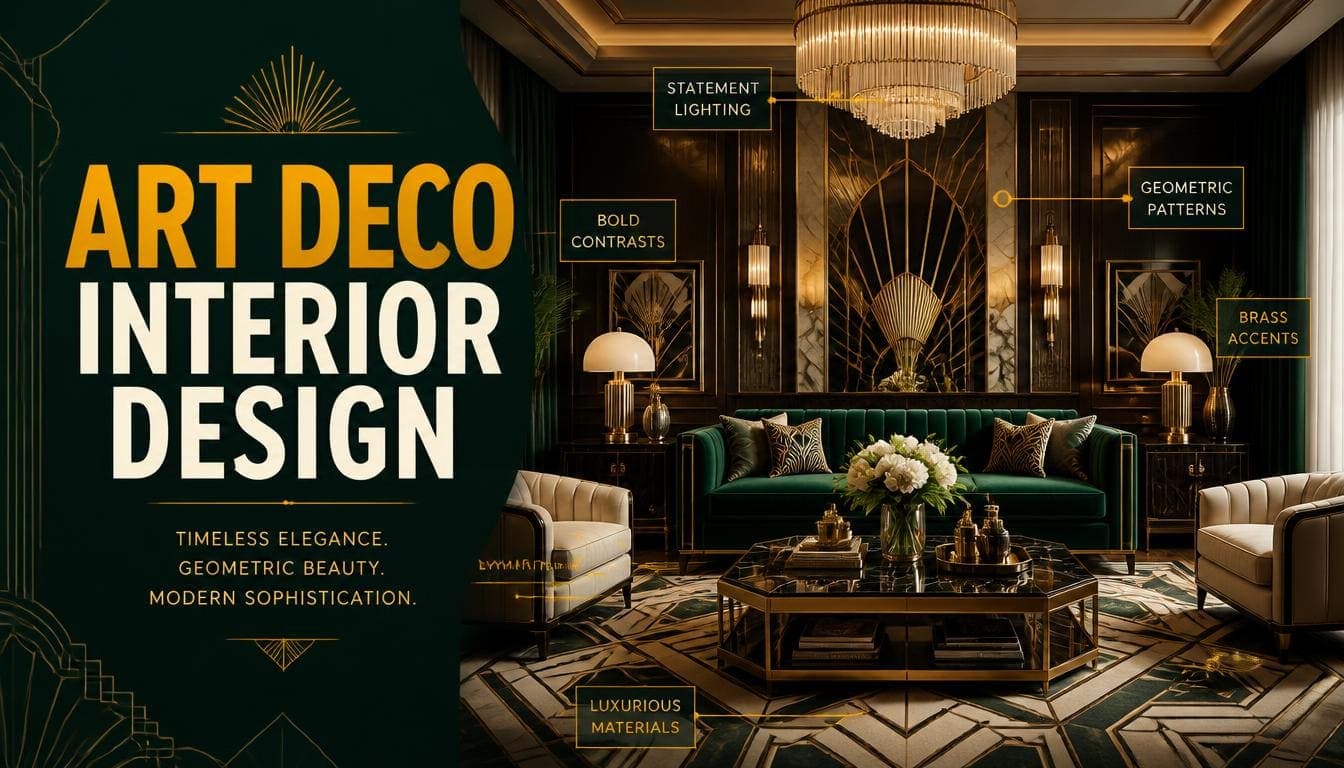
Bold geometry — Chevrons, sunbursts, stepped forms, zigzags, and repeated angular motifs.
Symmetry — Strongly symmetrical arrangements. Deco is formal in a way most twentieth-century movements aren't.
Luxurious materials — Lacquer, chrome, brass, marble, exotic veneers, mirror, glass.
Strong contrast — Black against gold, dark wood against pale stone, matte against high gloss.
Curved and stepped profiles — Rounded sofa arms, stepped cabinet fronts, curved mirrors.
Vertical emphasis — Tall mirrors, high-backed chairs, elongated forms. Deco reaches upward.
Craft and precision — Everything looks manufactured to a high standard. Nothing is rustic or handmade-looking.
Try DecoAI Free
3 free credits. No credit card needed. Stage any room in 30 seconds.
Get 3 Free CreditsThe Art Deco Palette
Base Colours
- Black — the defining base, used more confidently than in any other style
- Deep navy and midnight blue
- Emerald and forest green
- Cream and ivory — the light counterweight
- Charcoal
Metallics
- Gold and brass — the characteristic Deco metals
- Chrome and polished steel — the machine-age reference
- Silver and nickel — cooler alternative
The proportion: metallics are accents, not surfaces. Gold on a mirror frame, a lamp base, and cabinet hardware is Deco. Gold walls, gold furniture, and gold accessories is a theme.
Accent Colours
- Ruby red
- Peacock blue
- Burnt orange
- Jade
Used in small quantities — a chair, a cushion, a piece of glass.
What Art Deco Avoids
- Pastels
- Rustic or distressed finishes
- Natural fibre textures like jute and rattan
- Anything that looks handmade or imperfect
- Muted or dusty tones
Materials
Lacquer
High-gloss finishes, typically black, deep red, or cream. The most characteristic Deco surface treatment.
Exotic Veneers
Macassar ebony, burr walnut, and zebrawood used in book-matched patterns. The grain is treated as a decorative element.
Marble and Stone
Green marble, black marble with white veining, and travertine. Used for table tops, fireplaces, and bathroom surfaces.
Mirror and Glass
Mirrored furniture, mirrored panels, and etched or frosted glass. Deco used mirror architecturally rather than just for reflection.
Velvet
Deep jewel-toned velvet on upholstery — emerald, sapphire, ruby.
Chrome and Brass
Furniture frames, lighting, and hardware. The machine-age materials.
Art Deco by Room
Living Room
Furniture: Curved-arm sofa in velvet, club chairs, a stepped or geometric coffee table in marble or lacquer
Palette: Deep base — navy, emerald, or black — with cream and gold accents
Textiles: A geometric rug, velvet cushions, heavy curtains in a rich tone
Lighting: A statement geometric pendant, plus table lamps with fluted or stepped bases
Detail: A large mirror with a geometric frame, symmetrical artwork placement
Bedroom
Furniture: Upholstered bed with a tall curved or stepped headboard, matching bedside tables, a lacquered dresser
Palette: Deep tones with cream bedding
Detail: A mirrored surface, a velvet bench at the foot, symmetrical bedside lamps
Bathroom
Deco works exceptionally well in bathrooms.
Surfaces: Black and white geometric floor tile, marble, chrome fittings
Detail: A large mirror with a metal frame, wall sconces either side
The classic: black and white chequerboard or hexagonal tile with brass fittings
Dining Room
Furniture: Round or oval table in lacquer or marble, upholstered chairs with curved backs
Lighting: A statement geometric chandelier — the strongest Deco signal in a dining room
Detail: A sideboard with stepped detailing, symmetrical wall treatment
Kitchen
The hardest room for Deco, since kitchens are functional and Deco is decorative.
Where it works: dark cabinets with brass hardware, marble worktops, geometric tile splashback.
Where it doesn't: attempting full period Deco in a working kitchen.
Try DecoAI Free
3 free credits. No credit card needed. Stage any room in 30 seconds.
Get 3 Free CreditsUsing Art Deco Now
Full period Deco reads as themed in most contemporary homes. The workable version is more restrained.
Deco-Influenced Rather Than Deco
Keep: the geometry, one or two luxurious materials, strong contrast, symmetry, and vertical emphasis.
Reduce: the quantity of metallic, the number of geometric motifs, and the overall density.
Drop: fan motifs, sunburst mirrors as a centrepiece, and anything that references the 1920s explicitly.
The Practical Version
One statement piece — a geometric mirror, a marble table, a velvet chair.
A deep base colour on one wall or in the upholstery.
Brass hardware consistently but not everywhere.
Symmetrical arrangement — this carries more Deco character than any single object.
Geometric pattern in one element — a rug, a cushion, a tile.
This reads as considered and slightly glamorous without reading as a period recreation.
Where Full Deco Works
Genuine 1920s and 1930s properties with original features — curved walls, original tiling, period windows.
Bathrooms — the one room where full Deco reads well in a modern property.
Hotels, bars, and restaurants — commercial settings where drama is appropriate and people aren't living with it daily.
Where Art Deco Works and Doesn't
Works
Period properties from the era — architecture and style align.
Larger rooms — Deco's proportions and symmetry need space.
High ceilings — the vertical emphasis needs height to work.
Premium properties — the material palette signals expense appropriately.
Bathrooms — the one universal application.
Urban apartments with good proportions — Deco was an urban style.
Doesn't
Small rooms — dark palettes and substantial furniture both work against compact spaces.
Low ceilings — the vertical emphasis has nowhere to go.
Family homes — the register is formal and the materials aren't forgiving.
Rural and cottage properties — Deco is emphatically urban.
Modest properties — the material palette creates an expectation mismatch.
Property staging generally — too specific and too formal for most markets.
Common Art Deco Mistakes
1. Too Much Gold
The defining error. Gold on hardware, one mirror, and one lamp is Deco. Gold on everything is a theme.
2. Motif Overload
Chevrons on the rug, fans on the wall, sunbursts on the mirror, and stepped detailing on every cabinet. One or two geometric motifs, repeated, works. Five different ones doesn't.
3. Ignoring Symmetry
Deco is formal. Asymmetric arrangements lose the character regardless of the objects used.
4. Using It in Small Rooms
Dark palettes plus substantial furniture plus high-gloss surfaces reads as oppressive in a compact space.
5. Mixing With Rustic
Natural fibre, distressed wood, and handmade texture are the opposite of Deco's manufactured precision.
6. Period Recreation
A room that looks like a film set reads as costume. Deco-influenced works; Deco replica doesn't.
7. High Gloss Everywhere
Lacquer is characteristic, but every surface glossy produces glare and reads as cheap.
Art Deco vs Similar Styles
| Factor | Art Deco | Mid-century | Luxury | Industrial |
|---|---|---|---|---|
| Period | 1920–1940 | 1945–1969 | Ongoing | 1960s–now |
| Geometry | Bold, angular | Organic curves | Varies | Structural |
| Symmetry | Strong | Loose | Moderate | Loose |
| Metals | Gold, chrome | Brass, steel | Brass, gold | Blackened steel |
| Materials | Lacquer, marble, veneer | Teak, walnut, plywood | Velvet, marble | Concrete, brick |
| Contrast | Very high | Low to moderate | Moderate | High |
The closest relative: Luxury. Both use rich materials and deep colour. Deco adds geometry and symmetry; Luxury is softer and less structured.
For Property Presentation
If the Property Has Original Deco Features
Photograph them. Original tiling, curved walls, period windows, and built-in features are genuine selling points.
Don't fight them. Contemporary staging in a Deco property creates visual conflict. Transitional or restrained Deco-influenced staging works better.
If You're Staging
Generally avoid full Deco. It's too specific and too formal for most markets.
The exception: premium urban apartments with high ceilings and good proportions, where Deco-influenced staging can signal the tier appropriately.
The safer approach: Contemporary or Luxury staging with one geometric element — a mirror or a rug — which references Deco without committing to it.
Frequently Asked Questions
What is Art Deco interior design?
A design movement from roughly 1920–1940 characterized by bold geometry, symmetry, luxurious materials like lacquer and marble, strong contrast, and vertical emphasis.
What colours are Art Deco?
Black, deep navy, emerald, and charcoal as bases, with cream as the light counterweight. Gold, brass, and chrome as metallic accents. Ruby, peacock blue, and jade in small quantities.
What materials define Art Deco?
Lacquer, exotic veneers like macassar ebony, marble, mirror and glass, velvet, chrome, and brass. Everything looks manufactured to a high standard.
How do I use Art Deco without it looking themed?
Keep the geometry, symmetry, and one or two luxurious materials. Reduce the metallic quantity. Drop explicit period references like fan motifs and sunburst mirrors.
Does Art Deco work in small rooms?
Poorly. Dark palettes, substantial furniture, and high-gloss surfaces all work against compact spaces.
What's the difference between Art Deco and mid-century modern?
Deco is 1920s–40s, angular, symmetrical, and uses lacquer and marble. Mid-century is 1945–69, organic and curved, asymmetrical, and uses teak and plywood.
Where does Art Deco work best in a modern home?
Bathrooms. Black and white geometric tile with brass fittings reads as timeless rather than themed, unlike full Deco in a living room.
Is Art Deco good for property staging?
Generally not — too specific and too formal for most markets. The exception is premium urban apartments with high ceilings.
How much gold should an Art Deco room have?
Accents only — hardware, one mirror frame, one lamp base. Gold as a surface treatment reads as a theme rather than a style.
Summary
What it is: 1920s–40s design defined by bold geometry, strong symmetry, luxurious manufactured materials, and high contrast.
The palette: black, navy, emerald, and cream, with gold, brass, and chrome as accents.
The modern version: keep the geometry, symmetry, and one or two rich materials. Drop the explicit period motifs.
Where it works: period properties from the era, larger rooms with high ceilings, premium properties, and bathrooms in any property.
Where it doesn't: small rooms, low ceilings, family homes, rural properties, and most staging.
The defining error: too much gold. Accents only.
For staging, keep it restrained. DecoAI gives 3 free credits with no card required — Contemporary or Luxury with one geometric element usually outperforms full Deco for property marketing.