Colour does more work in a staged image than any other single decision. It determines whether a room reads as large or small, warm or clinical, current or dated — often before a viewer consciously registers anything else.
It's also where most staging goes wrong, usually in one of three ways: too much colour, the wrong temperature, or a palette that fights the room's existing fixed elements.
This covers the combinations that work, why they work, and the ones that consistently fail.
The Structure of a Working Palette
Every effective interior palette has three layers. The proportions matter more than the specific colours.
The 60-30-10 Framework
60% — Dominant. Walls, large floor areas, the biggest surfaces. Almost always a neutral.
30% — Secondary. Large furniture, curtains, rugs. A related neutral or a muted tone.
10% — Accent. Cushions, artwork, small objects. Where colour actually appears.
Why this works for staging: it keeps the room readable. A viewer's eye needs somewhere to rest, and 60% neutral provides it.
The common failure: pushing accent colour to 25–30%. The room stops reading as neutral and starts expressing a specific taste.
Try DecoAI Free
3 free credits. No credit card needed. Stage any room in 30 seconds.
Get 3 Free CreditsPalettes That Work
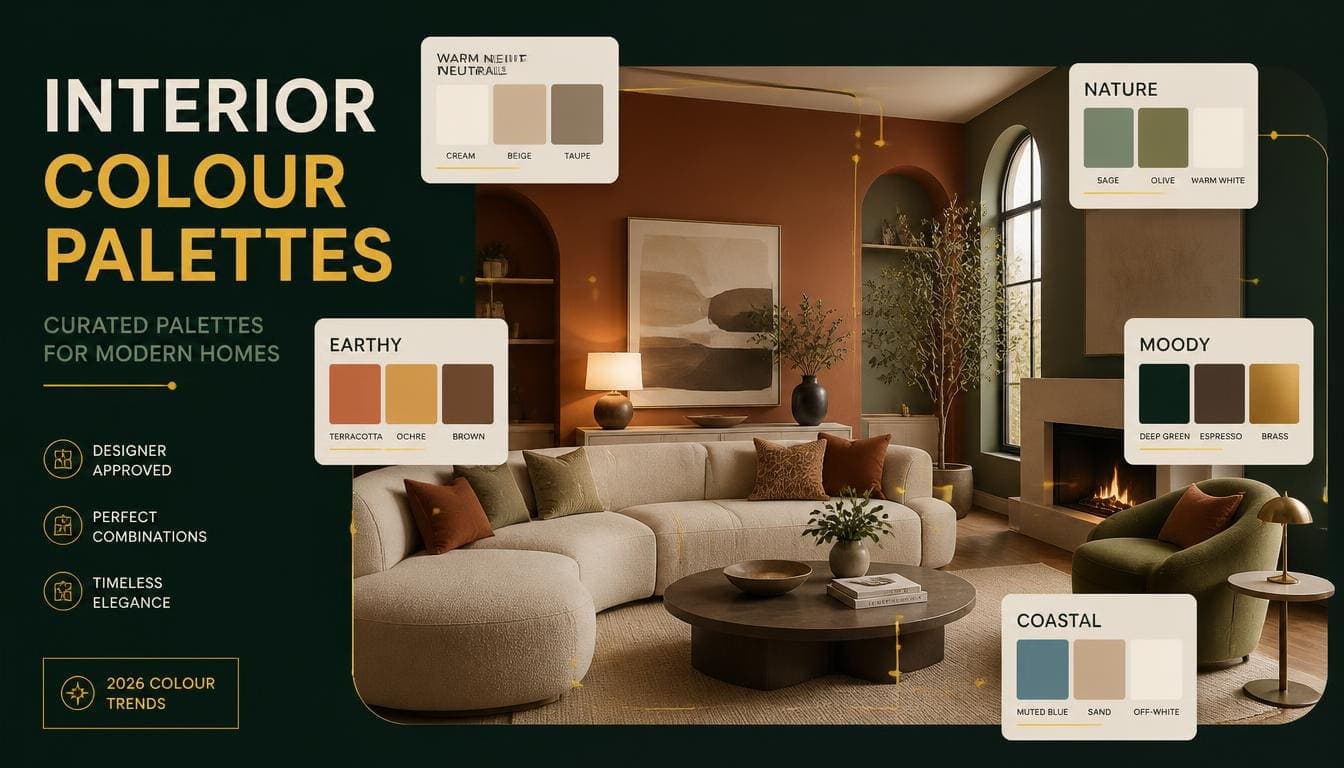
Warm White + Oak + Sage
Dominant: Warm white walls Secondary: Light oak furniture, oatmeal upholstery Accent: Sage green in cushions and a plant
Why it works: The warmest of the reliably neutral palettes. Sage is the least divisive accent colour available — it reads as natural rather than as a colour choice.
Best for: Scandinavian and Contemporary staging. Family markets. Small rooms.
Photographs: Exceptionally well. Light bounces, nothing competes.
Greige + Taupe + Terracotta
Dominant: Greige walls Secondary: Taupe or mushroom upholstery Accent: Terracotta and clay tones
Why it works: The defining current palette. Warm without being yellow, neutral without being flat.
Best for: Contemporary staging. Suburban and mid-market properties.
Photographs: Well in varied lighting. Forgiving of imperfect white balance.
White + Pale Wood + Dusty Blue
Dominant: White walls Secondary: Pale birch or ash furniture, white and grey textiles Accent: Dusty blue in cushions and artwork
Why it works: Maximum brightness with just enough colour to avoid feeling clinical.
Best for: Scandinavian staging. Small rooms. Properties with limited natural light.
Photographs: Best of any palette in low light.
Cream + Walnut + Deep Green
Dominant: Cream or warm ivory walls Secondary: Mid-tone walnut furniture Accent: Forest or olive green
Why it works: Warmer and more traditional without reading as dated. The green accent adds depth that pure neutrals lack.
Best for: Traditional and Transitional staging. Period properties. Family homes.
Photographs: Well in good light. Needs adequate lighting — it goes heavy in dim rooms.
Warm White + Black + Natural Texture
Dominant: Warm white walls Secondary: Natural fibre rug, linen upholstery Accent: Matte black in lighting, frames, and hardware
Why it works: Contrast without colour. The black provides definition that all-neutral palettes lack.
Best for: Modern and Minimalist staging. Urban properties.
Photographs: Very well — the contrast gives images structure.
Charcoal + Brass + Ivory
Dominant: Ivory or warm white walls Secondary: Charcoal upholstery Accent: Brass in lighting and hardware
Why it works: Reads as considered and slightly premium without committing to full Luxury staging.
Best for: Luxury and premium Contemporary. Properties with good natural light.
Photographs: Well in strong light. Poorly in dim rooms — charcoal goes muddy.
Try DecoAI Free
3 free credits. No credit card needed. Stage any room in 30 seconds.
Get 3 Free CreditsPalettes That Fail
Cool Grey + White + Chrome
The 2010s palette. Now reads as clearly dated.
Why it fails: Cool grey has a blue undertone that photographs cold. Combined with chrome, it reads as commercial rather than residential.
The fix: shift the grey warm. Greige achieves the same neutrality without the coldness.
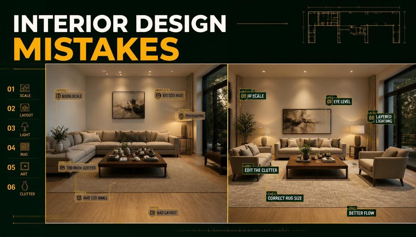
Multiple Competing Accents
Three or four accent colours used at similar weight.
Why it fails: No hierarchy. The eye doesn't know where to settle, and the room reads as busy rather than considered.
The fix: one accent, maximum two if they're closely related.
Saturated Base Colours
Deep navy, emerald, or burgundy on walls in a standard residential room.
Why it fails: Absorbs light, makes rooms look smaller, and divides opinion sharply.
Where it works: A single room in a premium property with strong natural light. Not as a general approach.
All-White With No Texture
White walls, white furniture, white textiles, no material variation.
Why it fails: Photographs flat. Nothing for the eye to register as depth, and it reads as clinical rather than clean.
The fix: add texture — a wool rug, a linen throw, visible wood grain. The palette can stay white; the surfaces shouldn't.
Warm and Cool Mixed
Beige walls with cool grey furniture. Warm wood with chrome fittings.
Why it fails: The temperatures fight each other, producing a result that looks unintentional even when nothing is individually wrong.
The fix: commit to one temperature. Warm palettes suit most residential staging.
Palette Ignoring Fixed Elements
Cool grey staging in a room with warm oak flooring. Warm cream staging against a grey tiled floor.
Why it fails: The staged furniture is fighting something you can't change.
The fix: read the room's fixed elements first — flooring, worktops, tiles, brickwork — and build the palette around them.
Colour by Room
Living Room
Best: Warm white or greige base, one muted accent Avoid: Multiple accents, saturated walls Note: This is your lead image. Keep it broadly appealing.
Bedroom
Best: White or soft neutral base, minimal accent Avoid: Anything busy — bedrooms sell on calm Note: Layered whites and creams outperform colour here.
Kitchen
Best: Whatever complements the existing units Avoid: Fighting the cabinet colour Note: Kitchens have the most fixed colour. Work with it rather than around it.
Dining Room
Best: Warmer palettes — cream, warm white, wood tones Consider: Deeper colour works better here than elsewhere. Dining rooms tolerate drama.
Home Office
Best: Neutral with one grounding accent Consider: Deeper colour — navy, olive — works well and reads as focused
Bathroom
Best: White with one texture element Avoid: Colour generally. Bathrooms photograph best clean and neutral.
Which Palettes Make Rooms Look Larger
Ordered by effect:
- White + pale wood + minimal accent — maximum light reflection
- Warm white + oak + sage — nearly as bright, warmer
- Greige + taupe + terracotta — good, slightly less reflective
- Cream + walnut + green — moderate; the wood tone reduces brightness
- Ivory + charcoal + brass — the charcoal absorbs noticeably
- Any saturated base — actively reduces perceived size
The principle: light reflects, dark absorbs. Perceived room size correlates directly with how much light the surfaces return.
Practical Rules
Read the Fixed Elements First
Flooring, worktops, tiles, brickwork, and window frames are fixed. Build the palette to complement them rather than choosing in isolation.
Warm oak floor → warm palette Grey tile floor → cooler neutrals work, but keep them warm-leaning Exposed brick → warm tones, avoid cool greys entirely
Commit to One Temperature
Warm or cool, not both. Warm suits most residential staging because it reads as more welcoming.
One Accent, Used Three Times
An accent colour appearing once looks accidental. Appearing three times — a cushion, a piece of art, a small object — reads as intentional.
Keep Accent Under 10%
Beyond that, it stops being an accent and starts being the palette.
Match Palette Temperature to Light
North-facing rooms get cool light. Warm palettes counteract this.
South-facing rooms get warm light. They can carry cooler palettes without feeling cold.
Test Against the Photograph, Not the Idea
A palette that sounds good can photograph flat. Generate the room and look at the actual image before committing to a style across a property.
Frequently Asked Questions
What colours are best for home staging?
Warm neutrals — warm white, greige, cream — as the base, with one muted accent such as sage, terracotta, or dusty blue.
What colours make a room look bigger?
Light-reflecting neutrals. White with pale wood is the most effective combination. Dark and saturated colours actively reduce perceived size.
Is grey still in style for interiors?
Cool blue-grey reads as dated. Warm greige and mushroom tones have replaced it and remain current.
How many colours should a room have?
One dominant neutral, one secondary neutral, and one accent. Beyond three, rooms read as busy.
What's the 60-30-10 rule?
60% dominant colour (walls and large surfaces), 30% secondary (large furniture and textiles), 10% accent (cushions, art, small objects).
What accent colours work best in staging?
Sage green, terracotta, dusty blue, and muted ochre. All read as natural rather than as strong colour choices.
Should I use dark colours in staging?
Sparingly. Deep colours absorb light and reduce perceived room size. They work in single rooms of premium properties with strong natural light.
Why does my staged room look flat?
Usually a lack of texture rather than a lack of colour. All-neutral palettes need material variation — wool, linen, wood grain — to give images depth.
How do I choose a palette for a room with existing flooring?
Read the flooring's temperature first. Warm wood calls for warm palettes; grey tile tolerates cooler neutrals. Fighting a fixed element rarely works.
Summary
The structure: 60% dominant neutral, 30% secondary neutral, 10% accent.
The reliable palettes: Warm white + oak + sage. Greige + taupe + terracotta. White + pale wood + dusty blue.
The failures: Cool grey with chrome, multiple competing accents, saturated bases, all-white with no texture, and mixing warm with cool.
For maximum perceived size: White with pale wood and minimal accent. Light reflects; dark absorbs.
The rule most people skip: read the room's fixed elements before choosing. A palette fighting the flooring never looks right regardless of how good it is in isolation.
Test palettes on your own room. DecoAI gives 3 free credits with no card required — enough to compare a warm and a cool palette in the same space and see which the room actually wants.