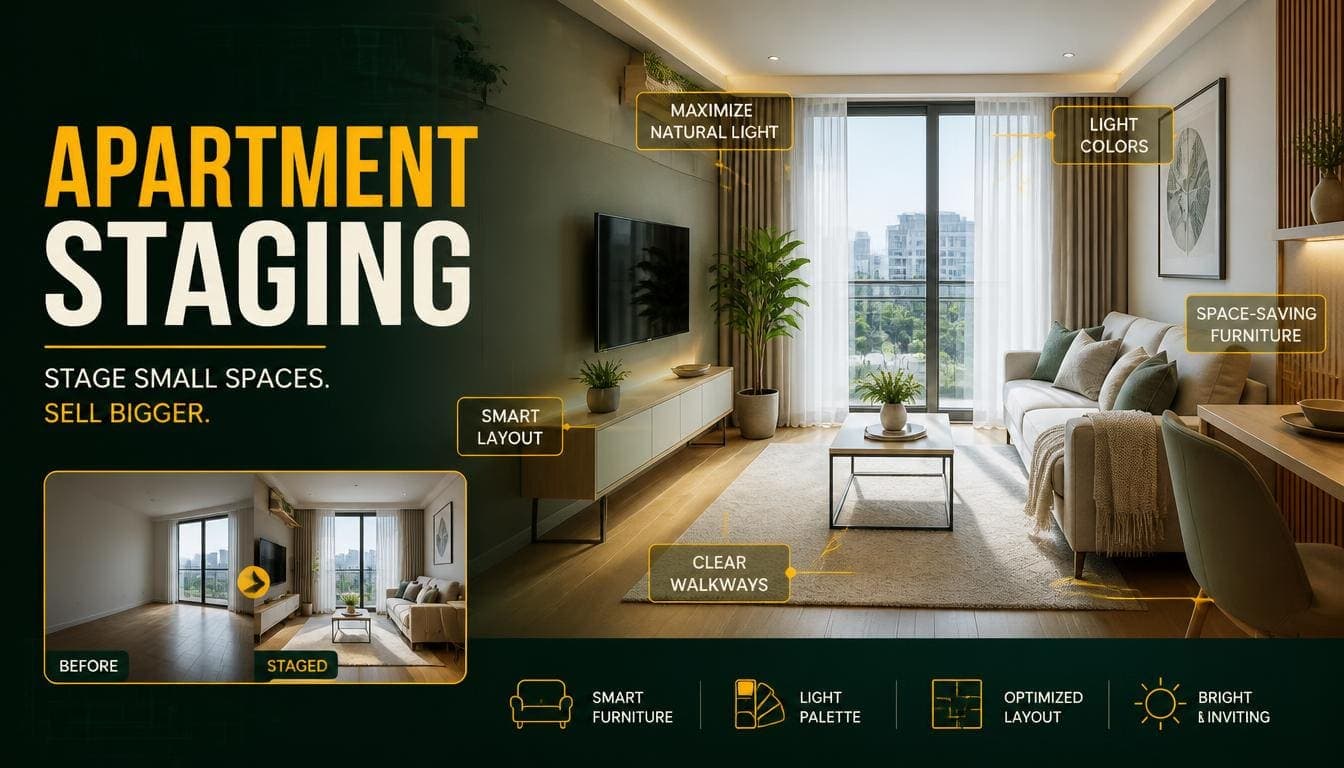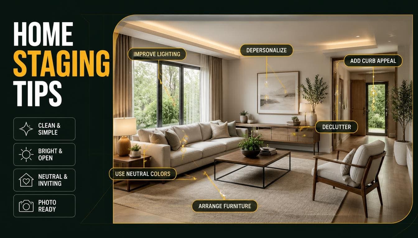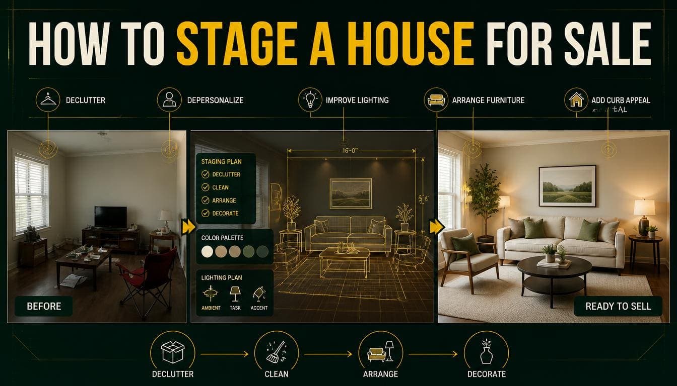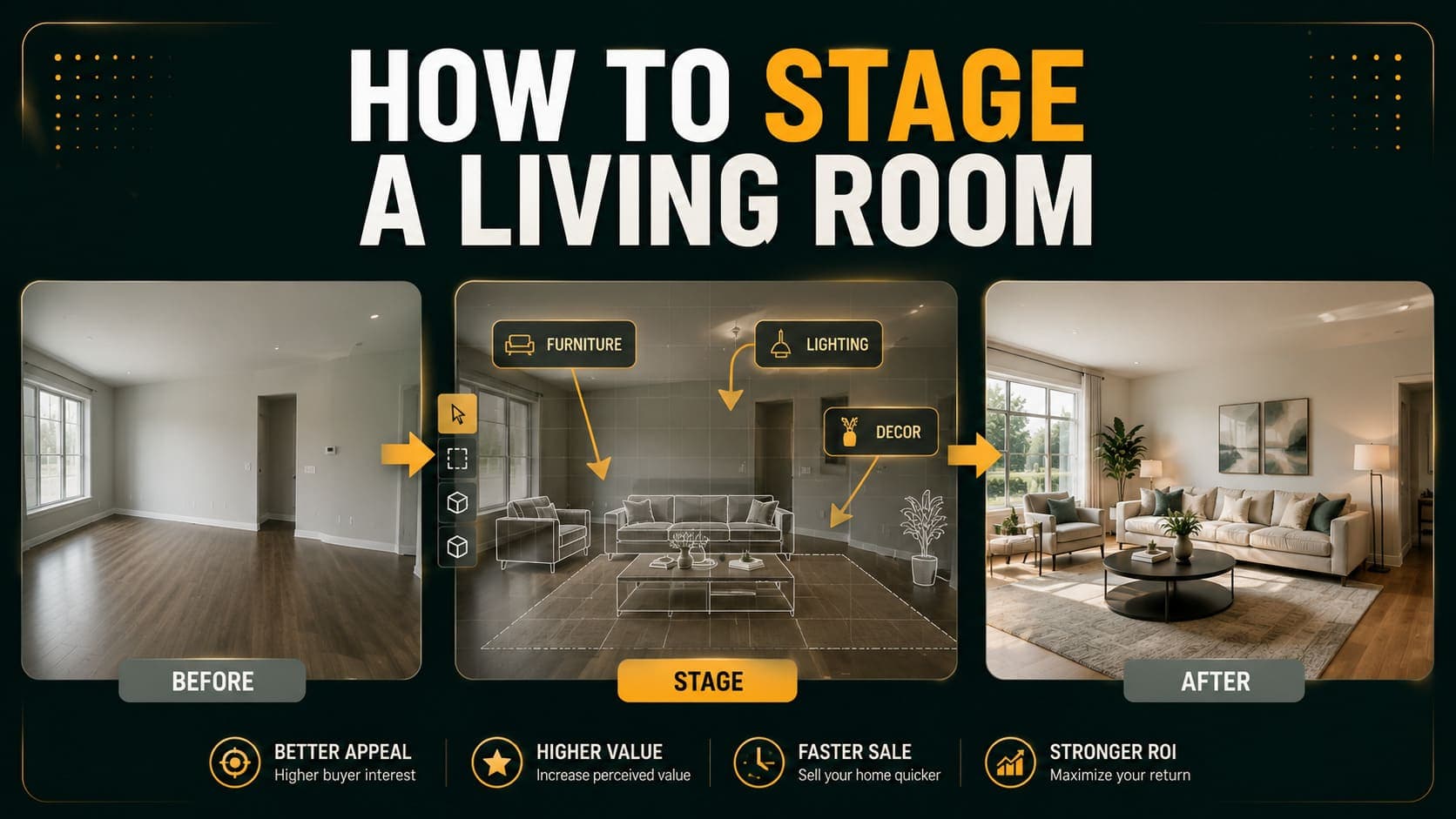
The living room is the image people remember. It's usually the thumbnail, it's almost always the first photo in the gallery, and it does more work than any other room in a listing.
Get it right and viewers scroll through the rest of the gallery. Get it wrong and they scroll to the next property.
This guide covers layout principles, style selection, the mistakes that make living rooms look smaller than they are, and how to stage one digitally in about 30 seconds.
Why the Living Room Carries the Listing
Three reasons this room matters disproportionately:
It's the emotional room. Bedrooms are functional, kitchens are practical, but the living room is where people picture their actual life happening — evenings, guests, weekends.
It's usually the largest space. Which means it's the room where scale, light, and layout are most visible.
It's the thumbnail. On most portals, the first image is what determines whether anyone clicks at all.
If you only stage one room, stage this one.
Try DecoAI Free
3 free credits. No credit card needed. Stage any room in 30 seconds.
Get 3 Free CreditsLayout Principles That Work
1. Create a Conversation Area
Furniture should face inward toward a central point, not outward toward walls.
The classic arrangement: a sofa facing two chairs or a second sofa, with a coffee table between them. This reads as a space where people gather.
Furniture pushed flat against every wall — a common instinct — makes the room feel like a waiting area rather than a home.
2. Leave Walking Space
There should be a visible, unobstructed path from the room's entrance through to any other doorways.
Rule of thumb: roughly 75–90cm of clear walkway. Less than that and the room reads as cramped even when it isn't.
3. Anchor with a Rug
A rug defines the seating area and gives the arrangement visual coherence.
Size matters: the rug should be large enough that at least the front legs of every seating piece sit on it. A rug that's too small makes the whole arrangement look like it's floating.
4. Face the Focal Point
Every living room has a natural focal point — a fireplace, a large window, a feature wall.
Orient the seating toward it. Fighting the room's natural focus produces an arrangement that feels wrong without being obviously wrong.
5. Scale Furniture to the Room
Oversized furniture in a small room is the fastest way to make a space look cramped. Undersized furniture in a large room makes it look sparse and unfinished.
Small room: loveseat instead of a three-seater, a slim armchair, one side table Large room: full sectional or two sofas, multiple seating zones, larger rug
6. Layer the Lighting
A single ceiling light produces flat, uninteresting photos. Adding a floor lamp and a table lamp creates depth and warmth.
Even in staged images, visible lamps signal "this room has good lighting options."
Choosing a Style
The living room style sets the tone for the entire property.
Modern
Clean lines, neutral palette, low-profile furniture. Best for: Urban apartments, new builds, professional buyers Effect: Spacious and current
Scandinavian
Light wood, white walls, soft textiles. Best for: Compact rooms, properties with good light, younger buyers Effect: Bright and calm — makes small rooms feel larger
Contemporary
Mixed materials, softer edges, layered but not cluttered. Best for: Suburban homes, mid-range price points, family buyers Effect: Comfortable and broadly appealing
Traditional
Classic wooden furniture, warm neutrals, symmetry. Best for: Family homes, period properties, established neighborhoods Effect: Warm and familiar
Luxury
Premium materials, statement lighting, rich fabrics. Best for: Premium properties only Effect: Impressive — but only if the property matches
Industrial
Exposed textures, metal, darker tones. Best for: Lofts and conversions with existing character Effect: Distinctive — needs architectural support
Which to Choose If You're Unsure
Modern for urban properties, Contemporary for suburban ones. Both are low-risk defaults that rarely produce a bad result.
If you want to be certain, generate the room in two or three styles and compare. At $0.10 per image, testing costs $0.30.
Try DecoAI Free
3 free credits. No credit card needed. Stage any room in 30 seconds.
Get 3 Free CreditsRoom-Size Specific Advice
Small Living Rooms (under 15 m²)
Style: Scandinavian or Minimalist Furniture: Loveseat, one armchair, small coffee table, one side table Rug: Medium — large enough to anchor, small enough to leave visible floor Avoid: Sectionals, heavy dark furniture, multiple large pieces
Key principle: show floor. Visible floor space is what makes a room read as larger.
Medium Living Rooms (15–25 m²)
Style: Modern, Scandinavian, or Contemporary Furniture: Three-seat sofa, two chairs, coffee table, side tables, floor lamp Rug: Large enough for front legs of all seating Avoid: Cramming in extra furniture just because there's space
Large Living Rooms (over 25 m²)
Style: Contemporary, Traditional, or Luxury Furniture: Consider two seating zones — a main conversation area and a secondary reading corner Rug: Large, or two rugs defining separate zones Avoid: A single small arrangement floating in a big room — it makes the space feel empty rather than generous
Open-Plan Living Areas
The challenge here is definition. Without walls, the living area needs to feel distinct from the dining or kitchen space.
Solution: Use a rug to define the living zone, and orient the sofa so its back creates a soft boundary between areas.
Common Living Room Staging Mistakes
1. Pushing All Furniture Against Walls
The most common error. It makes the room feel like a hotel lobby rather than a home. Pull furniture inward to create a conversation area.
2. Oversized Furniture
A sectional in a 12 m² room fills the frame and leaves no visible floor. The room looks smaller than it is.
3. Rug Too Small
A rug that only sits under the coffee table looks like a placemat. It should extend under at least the front legs of the seating.
4. No Focal Point
If the seating faces nothing in particular, the arrangement feels arbitrary. Orient toward the fireplace, window, or feature wall.
5. Blocking the Walkway
Furniture obstructing the path between doorways reads as impractical, even in a photo.
6. Too Much Furniture
Every additional piece reduces visible floor. More furniture doesn't demonstrate more space — it demonstrates less.
7. Style Mismatch with the Property
Industrial staging in a suburban semi. Luxury staging in a budget flat. The mismatch registers immediately.
8. Ignoring the Light Source
Placing a large piece in front of the main window blocks the property's best feature.
Staging a Living Room with AI
Step 1: Clear the Room Completely
Every object. Boxes, chairs, cleaning supplies, cables — all of it. AI staging works by mapping empty space, and leftover objects produce artifacts.
Step 2: Prepare the Light
Open all curtains and blinds. Turn on every light. Shoot between 10am and 2pm.
Step 3: Shoot from a Corner
Stand in the corner furthest from the main window, facing diagonally across the room. Camera at chest height, level.
Shoot two or three angles — some stage better than others.
Step 4: Upload and Select
Room type: Living Room Style: Whichever matches your market and price point
Step 5: Generate and Review
Check at full size:
- Does the furniture sit flat on the floor?
- Is the scale right for the room?
- Do shadows match the real light direction?
- Is anything blocking a doorway or window?
Step 6: Generate Variations
Produce three to five options. At $0.10 each, picking the best from five costs $0.50 and meaningfully improves the result.
Before-and-After: What Changes
An empty living room communicates:
- Square footage (approximately)
- Wall and floor condition
- Window positions
A staged living room communicates:
- Scale — how large the space actually is in practical terms
- Function — where a family would sit, watch, and gather
- Lifestyle — what living here would feel like
- Light quality — how the room feels at different times
That second list is what generates inquiries.
Frequently Asked Questions
What is the most important room to stage?
The living room. It's typically the listing thumbnail and does the most work in generating clicks.
Should the sofa face the window or the wall?
Face the room's natural focal point. If the window is the best feature, orienting toward it works — but avoid blocking it with a high-backed piece.
How big should the living room rug be?
Large enough that at least the front legs of every seating piece rest on it. A rug that only sits under the coffee table looks undersized.
What style makes a living room look bigger?
Scandinavian or Minimalist. Light palettes and restrained furniture maximize visible floor and perceived space.
How much furniture should a staged living room have?
For a medium room: sofa, two chairs, coffee table, rug, one or two lamps. Enough to show function, not so much that floor space disappears.
Should I stage the living room if the property is furnished?
If the existing furniture is attractive and well-arranged, photograph it as is. If it's dated, oversized, or badly arranged, clearing and staging digitally usually produces a better result.
How much does it cost to stage a living room?
$0.10 per image with pay-per-image AI tools. Testing three styles costs $0.30. Human designer services charge $16–$49 per image.
Can I stage the same living room in multiple styles?
Yes. It's one of the main advantages of digital staging and costs $0.10 per additional style.
What should I do if the living room is very small?
Use Scandinavian or Minimalist staging, keep furniture minimal, shoot from the corner to maximize visible floor, and ensure the room is very well lit.
Quick Checklist
Room prep
- Completely empty
- Floors clean
- All curtains open
- All lights on
Photography
- Corner position, facing diagonally
- Chest height (~1.2m)
- Camera level
- Two or three angles
- Midday light
Staging choices
- Style matched to market and price point
- Room type set to Living Room
- Three to five variations generated
- Reviewed at full size
Layout to look for in the result
- Conversation area, not wall-hugging furniture
- Visible walkway to doorways
- Rug anchoring the seating
- Furniture scaled to the room
- Nothing blocking the main window
Stage your living room now. DecoAI gives 3 free credits with no card required — enough to test three styles on your main room and pick the strongest.