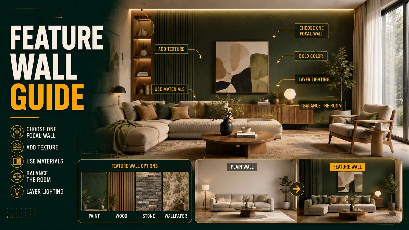
Feature walls are one of the most divisive decisions in interior design. Done well, a single treated wall gives a room a focal point and depth. Done badly — which is most of the time — it looks like someone ran out of paint.
The difference is almost always which wall was chosen. The treatment matters less than the position.
The Case Against Feature Walls
Worth addressing first, because many designers avoid them entirely.
The Argument
They're often arbitrary. A wall treated differently for no architectural reason reads as a decorating decision rather than a design one.
They can make rooms feel smaller. A dark or busy wall pulls that wall visually forward, which reduces the sense of space in most rooms.
They date. The specific treatments that have been popular — one dark wall, one wallpapered wall, one panelled wall — each carry a period signal.
Colour drenching has largely replaced them. Painting all four walls, the trim, and often the ceiling in one colour produces a more sophisticated result than treating one wall differently.
The Counter-Argument
Feature walls work when the wall already has a reason to be featured — a fireplace, a bed head, a structural alcove, or a natural focal point.
In that case, the treatment reinforces something architectural rather than inventing a distinction.
The practical position: don't create a feature wall. Identify the wall that's already the focal point and treat that one, if any.
Try DecoAI Free
3 free credits. No credit card needed. Stage any room in 30 seconds.
Get 3 Free CreditsChoosing the Right Wall
This is the decision that determines whether it works.
The Wall That Already Has Focus
Living room: the wall with the fireplace, or the wall the seating faces.
Bedroom: the wall behind the bed.
Dining room: the wall behind the main seating position.
Home office: the wall behind the desk, visible on video calls.
The Wall You See on Entering
The wall directly opposite the door is the first thing seen. Treating it gives the room an immediate focal point.
The caveat: in a small room, a dark wall opposite the door pulls forward and makes the space read as shorter.
What Not to Choose
A wall with a door in it. The door interrupts the treatment and the result looks accidental.
A wall with a window in it. Same problem, and the window is already the focal point.
The wall behind the sofa — unless it's also the focal wall. If the seating faces away from it, the feature is behind everyone.
A wall chosen because it's blank. The most common error. A blank wall isn't a reason to feature it.
Any wall in a small dark room. The treatment reduces the sense of space that the room can't spare.
Treatments That Work
Paint
The simplest, cheapest, and easiest to reverse.
Best for: a deeper tone of the surrounding colour, rather than a contrasting one.
Why: a related deeper shade reads as intentional; a contrasting colour reads as arbitrary.
Cost: $30–$60.
Panelling
Shaker panelling, board and batten, or vertical slats.
Best for: bed heads, and walls in period properties where panelling has architectural precedent.
The caution: heavily prominent in the 2020s and carries a period signal already.
Cost: $150–$500 for a wall, DIY.
Wallpaper
Best for: rooms where you want pattern without committing all four walls.
The practical consideration: a bold pattern on one wall and plain on three reads as a compromise. A subtle texture reads better.
Cost: $80–$400 per wall depending on the paper.
Timber Cladding
Vertical or horizontal slats, usually in oak or a painted finish.
Best for: bed heads, and contemporary properties.
Adds: texture and acoustic benefit, which paint doesn't.
Cost: $200–$600 per wall.
Exposed Brick or Stone
Where it exists architecturally.
Best for: period and converted properties where the material is genuine.
The caveat: applied brick slips read as fake. Genuine exposed structure works; simulated doesn't.
Tile
Best for: kitchens and bathrooms, where it's functional as well as decorative.
Full-height tile on one wall in a bathroom reads as intentional in a way a painted feature wall doesn't.
Built-In Joinery
Arguably the best feature wall treatment, because it's functional.
Alcove units either side of a chimney breast, or a full wall of built-in storage, gives the wall architectural presence rather than just a different surface.
Cost: $600–$4,000 depending on scope.
Treatments That Usually Don't Work
One Dark Wall in a Small Room
Pulls the wall forward and reduces the sense of space that the room can't spare.
Bold Pattern on One Wall
Reads as a compromise between wanting pattern and not committing to it.
Wall Decals and Stickers
Read as temporary, which they are.
Photo Murals
Date extremely quickly and are difficult to remove.
A Different Colour With No Relationship
An accent wall in a colour unrelated to the rest of the room reads as arbitrary.
Feature Walls in Multiple Rooms
If every room has one, the effect stops being a feature and becomes the property's default.
The Alternative: Colour Drenching
The approach that has largely replaced feature walls in contemporary design.
What It Is
Painting all four walls, the trim, the doors, and sometimes the ceiling in a single colour.
Why It Works
No visual breaks. The lines at every skirting board, door frame, and cornice disappear, which makes rooms look taller and more cohesive.
More sophisticated. It reads as a considered decision rather than a decorating shortcut.
It suits deeper colours. A deep green room drenched reads as enveloping; a single deep green wall reads as unfinished.
Where It Works
Small rooms — counter-intuitively, drenching a small room in a deeper colour can make it feel more intentional and less like a cramped white box.
Rooms with architectural detail — cornicing and panelling in the same colour as the walls reads as sculptural rather than decorative.
Rooms used for a specific purpose — home offices, dining rooms, and snugs, where a distinct atmosphere is appropriate.
Where It Doesn't
Open plan spaces — a drenched zone in an open plan area creates a boundary that fights the layout.
Rooms with poor light — a deep colour in a dark north-facing room reads as gloomy rather than enveloping.
Properties being sold — drenching is a strong statement, and staging works better neutral.
Try DecoAI Free
3 free credits. No credit card needed. Stage any room in 30 seconds.
Get 3 Free CreditsBy Room
Living Room
Best wall: the one with the fireplace, or the one the seating faces.
Best treatment: built-in alcove joinery, or a deeper tone of the surrounding colour.
Avoid: the wall behind the sofa if the seating faces away from it.
Bedroom
Best wall: behind the bed. The clearest architectural justification for a feature wall in any room.
Best treatment: panelling, timber slats, or a deeper paint tone.
Why it works here: the bed already anchors that wall, so treating it reinforces something rather than inventing it.
Dining Room
Best wall: the one visible from the main seating position.
Best treatment: a deeper colour or wallpaper. Dining rooms tolerate more drama than other rooms.
Home Office
Best wall: behind the desk — visible on video calls.
Best treatment: a deeper colour, or shelving.
Practical note: what's behind you on calls is seen more than any other wall in your property.
Kitchen
Best treatment: tile, and only on a wall where it's functional — the splashback run.
Avoid: painted feature walls in kitchens. There's rarely enough uninterrupted wall.
Bathroom
Best treatment: full-height tile on one wall, usually behind the bath or in the shower.
Why it works: it's functional as well as decorative.
For Property Presentation
Should You Remove a Feature Wall Before Selling?
Yes if: it's a strong colour, a bold pattern, or a treatment that divides opinion.
Cost to remove: $30–$60 for paint, more for wallpaper or panelling.
Why: a feature wall is a taste statement, and staging works by leaving room for the buyer's taste rather than displaying yours.
No if: it's built-in joinery or genuine architectural material, both of which read as value rather than decoration.
What to Do Instead
Neutral throughout, with the visual interest coming from staging and photography rather than wall treatment.
The Exception
Genuine architectural features — exposed brick, original panelling, a stone chimney breast. These aren't feature walls; they're the property's character, and they should be shown.
Common Mistakes
1. Choosing a Wall Because It's Blank
The most common error. A blank wall isn't a reason to feature it.
2. A Wall With a Door or Window in It
The opening interrupts the treatment and the result reads as accidental.
3. Unrelated Colour
A feature colour with no relationship to the rest of the room reads as arbitrary. A deeper tone of the same colour reads as intentional.
4. Dark Feature Walls in Small Rooms
Pulls the wall forward and reduces perceived space.
5. Bold Pattern on One Wall
Reads as a compromise. Either commit to the pattern or don't use it.
6. Feature Walls in Every Room
The effect stops being a feature.
7. Photo Murals
Date very quickly and are difficult to remove.
8. Keeping a Feature Wall for Sale
It's a taste statement. Neutral leaves room for the buyer's.
Frequently Asked Questions
Which wall should be the feature wall?
The one that already has focus — the fireplace wall, the wall behind the bed, or the wall the seating faces. Never a wall chosen because it's blank.
Are feature walls out of style?
They've fallen out of favour among designers in favour of colour drenching. They still work when the wall has an architectural reason to be featured.
What is colour drenching?
Painting all four walls, the trim, doors, and sometimes the ceiling in one colour. It removes the visual breaks at every junction and reads as more considered than a single treated wall.
Do feature walls make rooms look smaller?
A dark or busy feature wall pulls that wall visually forward, which reduces the sense of space. In small rooms this is a real cost.
What colour should a feature wall be?
A deeper tone of the surrounding colour reads as intentional. A contrasting or unrelated colour reads as arbitrary.
Should the feature wall have a window or door in it?
No. The opening interrupts the treatment and the result looks accidental.
Is panelling a good feature wall?
Behind a bed, yes — the bed already anchors that wall. It's been prominent in the 2020s though, so it carries a period signal.
Should I remove a feature wall before selling?
If it's a strong colour or bold pattern, yes — $30–$60 in paint. If it's built-in joinery or genuine architectural material, keep it.
What's the best feature wall treatment?
Built-in joinery, because it's functional as well as visual. Alcove units either side of a chimney breast give a wall architectural presence rather than just a different surface.
Summary
The rule that matters: don't create a feature wall. Identify the wall that's already the focal point and treat that one, if any.
Best walls: the fireplace wall, the wall behind the bed, the wall the seating faces, or the wall visible on entering.
Never: a wall with a door or window in it, or a wall chosen because it's blank.
Best treatments: built-in joinery, a deeper tone of the surrounding colour, panelling behind a bed, or tile where it's functional.
The alternative: colour drenching — all walls, trim, and often the ceiling in one colour. More sophisticated, and it removes rather than adds visual breaks.
For selling: remove strong feature walls. Keep genuine architectural features.
Neutral stages better. DecoAI gives 3 free credits with no card required — staged rooms work best when the walls leave room for the buyer's taste rather than displaying yours.