Open plan spaces fail in a specific way: without walls to define areas, the space reads as one large undefined room rather than as several connected ones. The furniture floats, the functions blur, and the result feels less usable than the same floor area divided conventionally.
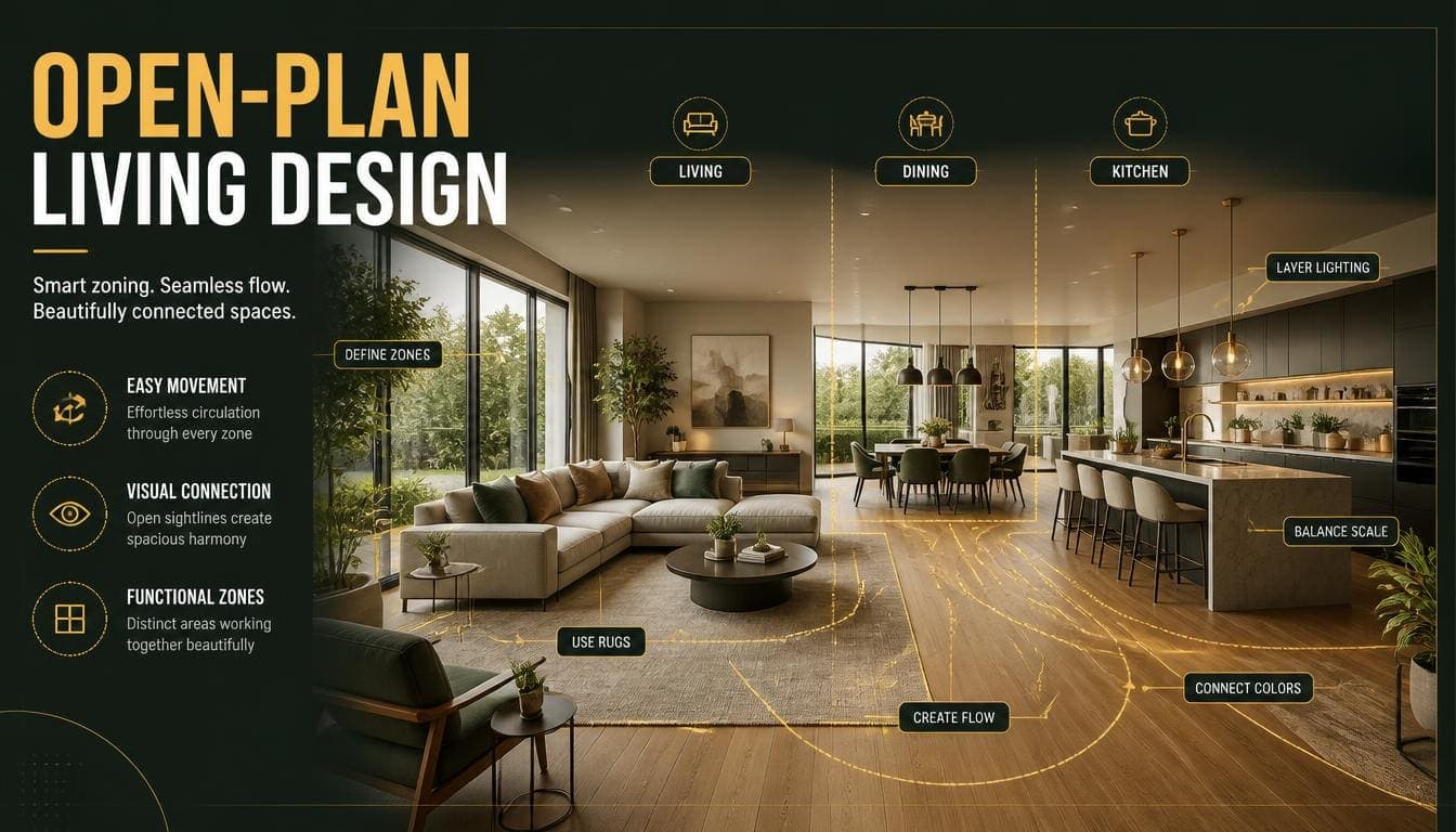
Fixing it is a matter of zoning — creating definition through means other than walls. There are five tools that do this, and using two or three of them together is usually enough.
Why Open Plan Needs Zoning
Without Definition, Space Reads as Emptiness
A 45 m² open plan area containing a sofa, a table, and a kitchen run has no readable structure. The eye doesn't know where one function ends and another begins.
The counter-intuitive result: undefined open plan can feel less generous than defined open plan, because the eye has nothing to measure against.
Functions Interfere
Cooking smells reach the sofa. Television noise reaches the dining table. Kitchen clutter is visible from every seat.
Zoning doesn't solve these entirely, but it manages them.
Furniture Has Nowhere to Anchor
In a conventional room, furniture relates to walls. In an open plan space, it has to relate to something else — a rug, a lighting position, or another piece of furniture.
Without that, arrangements read as arbitrary.
Try DecoAI Free
3 free credits. No credit card needed. Stage any room in 30 seconds.
Get 3 Free CreditsThe Five Zoning Tools
1. Rugs
The most effective and least expensive tool.
How it works: a rug defines a floor area, and the eye reads that area as a distinct zone.
Practical application: one rug under the living seating, another under the dining table if the space is large enough. Kitchen areas usually stay bare.
Sizing: the living rug should be large enough that at least the front legs of all seating rest on it. The dining rug should extend 60cm beyond the table edge.
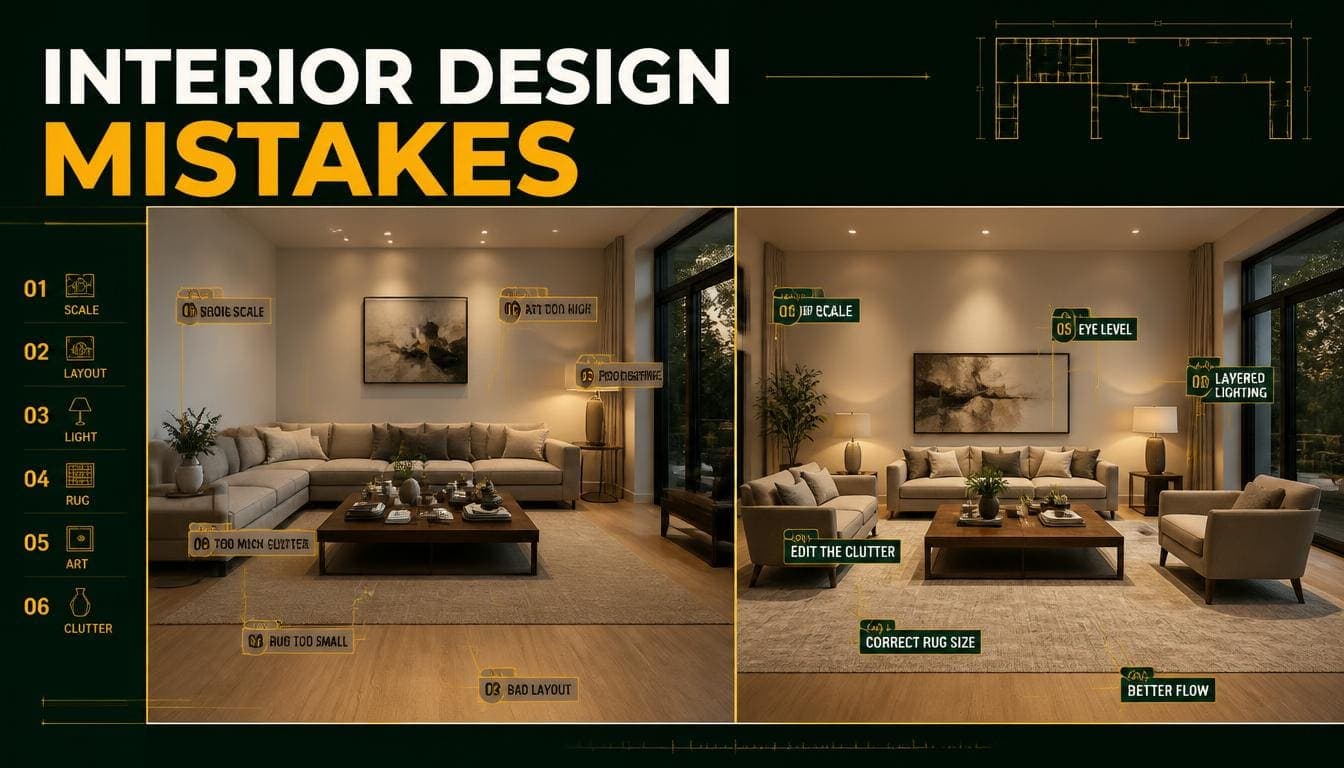
The most common error: an undersized rug that touches nothing. It defines nothing and reads as a placemat.
2. Lighting
The second most effective tool, and the one that works even when furniture is moved.
How it works: a pendant over a dining table establishes that zone visually. Downlights over a kitchen run define it. A floor lamp beside seating anchors the living area.
Practical application:
- Pendant centred over the dining table, hung 75–85cm above the surface
- Directional or recessed lighting over the kitchen work area
- Table and floor lamps in the living zone
Why lighting matters more here than in conventional rooms: it's the only zoning tool visible at night, when the rug and furniture arrangement are less legible.
3. Furniture Orientation
How it works: the back of a sofa creates a soft boundary. Furniture facing inward defines a zone; furniture facing outward doesn't.
Practical application: position the sofa with its back toward the dining or kitchen area, facing into the living zone. This does more zoning work than any single object.
The requirement: if the sofa back is visible from the rest of the space, it needs to look acceptable. A console table behind it solves this and adds a functional surface.
4. Level and Material Changes
How it works: a change in floor material or a step signals a change in function.
Practical application: tile in the kitchen and timber in the living area is common and effective.
The counter-argument: continuous flooring makes spaces look larger, which is why seamless design favours running one material throughout.
The resolution: in smaller open plan spaces, continuous flooring and rug-based zoning works better. In larger spaces, material changes can define zones without making the area feel divided.
5. Ceiling Treatment
How it works: a change in ceiling height, a dropped section, or exposed beams over one area signals a zone.
Practical application: usually an architectural decision rather than a furnishing one. Worth knowing about if you're renovating.
Cheaper alternative: lighting achieves much of the same effect without construction.
Layout Principles
Establish a Primary Circulation Route
There should be a clear path through the space that doesn't cross the middle of any zone.
The common failure: the route from the entrance to the kitchen passes directly through the living seating area.
The fix: arrange furniture so circulation runs along one edge of the living zone rather than through it.
Give Each Zone a Focal Point
Living: a window, a fireplace, or a television position. Dining: the pendant light. Kitchen: the island or the main work run.
Zones without a focal point read as leftover space.
Keep Sightlines Open at Standing Height
Low furniture between zones maintains the openness that justifies the layout. Tall furniture recreates the walls you removed.
Height guidance: furniture between zones below roughly 90cm. Sofa backs, low shelving, and console tables all work. Full-height bookcases and screens don't.
Position the Kitchen for Visibility
The kitchen is the zone that generates mess, and in an open plan layout it's always visible.
Practical implications:
- Prioritize storage so the worktop can stay clear
- Consider an island that screens the work area from the living zone
- Position the sink where it isn't the first thing seen from the entrance
Try DecoAI Free
3 free credits. No credit card needed. Stage any room in 30 seconds.
Get 3 Free CreditsKitchen, Dining and Living: The Standard Combination
The most common open plan arrangement, and it has a natural sequence.
The Usual Order
Kitchen at one end, usually where the services already are.
Dining in the middle, adjacent to the kitchen for practicality.
Living at the far end, furthest from kitchen noise and smells.
Why this works: it puts the functions in order of use, and it keeps the living area — where people spend the most time — furthest from the messiest zone.
Zoning the Sequence
- Kitchen to dining: the pendant light over the table marks the transition
- Dining to living: the sofa back, or a rug boundary, marks the second transition
Two clear transitions, both achievable without construction.
Sizing Guidance
For a comfortable three-zone open plan space:
| Zone | Minimum area |
|---|---|
| Kitchen | 8–10 m² |
| Dining | 8–10 m² |
| Living | 14–18 m² |
| Circulation | 4–6 m² |
| Total | 34–44 m² |
Below roughly 30 m², three zones become cramped. Two zones — kitchen-dining and living, or kitchen-living with a dining table doubling as a work surface — works better.
Where Open Plan Stops Being an Advantage
Worth being honest about, since it's been the default for two decades.
Noise
Sound travels. Television, conversation, cooking, and appliances all reach every zone.
Mitigation: soft flooring in the living area, acoustic ceiling treatment, upholstered furniture, and curtains. These help; they don't solve it.
Cooking Smells
Reach the entire space, including soft furnishings.
Mitigation: a genuinely effective extractor, ducted externally rather than recirculating.
Heating
One large volume is harder and more expensive to heat than several smaller ones.
No Retreat
Someone wanting quiet has nowhere to go within the space. In households with different schedules or activities, this matters more than the sociability benefit.
Visible Mess
The kitchen is always in view. In practice this means either constant tidying or living with visible clutter.
The Current Direction
There's been a partial move back toward "broken plan" — open plan with some division through half-walls, glazed partitions, sliding doors, or level changes.
The idea: connection without total openness. Sound and smell get some containment, and there's somewhere to retreat to.
Furnishing an Open Plan Space
Consistency Matters More Than in Separate Rooms
In separate rooms, style differences are hidden by walls. In an open plan space, everything is visible simultaneously.
Practical: one style, one palette, and consistent wood tones and metal finishes throughout.
Scale Up Slightly
Furniture that's correctly scaled for a conventional room can look undersized in a large open plan space.
Practical: a larger sofa, a bigger rug, a substantial dining table. Small pieces float.
Fewer, Larger Pieces
The temptation is to fill a large space with many items. Fewer larger pieces read as considered; many smaller ones read as scattered.
Repeat Elements Across Zones
A colour, a material, or a form appearing in each zone ties the space together.
Example: black metal in the kitchen hardware, the dining chair legs, and the living room lamp.
For Property Presentation
Photographing Open Plan
The challenge: showing the relationship between zones without any single shot looking cluttered.
Approach:
- One wide shot from the corner that shows all zones
- One shot from within the living zone looking toward the kitchen
- One shot from the kitchen looking toward the living area
- Detail shots of the kitchen if the specification is good
What buyers want to understand: how the zones relate, whether the kitchen is visible from the seating, and whether the space is large enough to actually function as intended.
Staging Open Plan
The zoning has to be visible in the photograph, or the space reads as one large empty area.
What creates that:
- A rug under the living seating
- A dining table with chairs
- Furniture oriented to define boundaries
The common staging failure: furniture floating in the middle of a large space with no rug and no defining elements. It reads as unfinished rather than open.
The Staging Note
AI staging handles open plan less reliably than conventional rooms, because there's more space to fill and less structure to work from.
What to check: does the generated arrangement create readable zones? Is there a rug defining the living area? Does the furniture relate to anything, or float?
If the result looks scattered, regenerate — open plan output varies more between attempts than single-room output.
Frequently Asked Questions
How do I zone an open plan space?
Five tools: rugs, lighting, furniture orientation, floor material changes, and ceiling treatment. Two or three together is usually enough.
What's the most effective way to define zones without walls?
A rug under the living seating and a pendant light over the dining table. Together they establish both zones clearly at minimal cost.
How big does an open plan space need to be?
Roughly 34–44 m² for three comfortable zones — kitchen, dining, and living. Below 30 m², two zones works better than three.
Should open plan spaces have continuous flooring?
In smaller spaces, yes — it makes the area look larger, with rugs providing the zoning. In larger spaces, a material change can define zones without making the area feel divided.
How do I stop an open plan space feeling like one big room?
Give each zone a rug, a focal point, and its own lighting. Orient furniture to face inward within zones rather than outward.
What are the downsides of open plan?
Noise, cooking smells reaching everywhere, higher heating costs, no retreat space, and permanently visible kitchen mess.
What is broken plan?
Open plan with partial division — half-walls, glazed partitions, sliding doors, or level changes. Connection without total openness, which addresses some of open plan's drawbacks.
How should I arrange furniture in open plan?
Kitchen at one end, dining in the middle, living at the far end. The sofa back facing the dining area creates the main boundary.
How do I photograph an open plan space?
One wide shot showing all zones, then one from each end looking toward the other. Buyers want to understand how the zones relate.
Summary
The core problem: without walls, open plan reads as one undefined room rather than several connected ones.
The five zoning tools: rugs, lighting, furniture orientation, floor material changes, ceiling treatment. Two or three together is usually enough.
The most effective pair: a rug under the living seating and a pendant over the dining table.
Sizing: roughly 34–44 m² for three comfortable zones. Below 30 m², use two.
The layout sequence: kitchen, dining, living — in order of use, with living furthest from the mess.
Where it stops helping: noise, smells, heating costs, no retreat, and permanently visible kitchen.
Check the zoning in staged images. DecoAI gives 3 free credits with no card required — open plan output varies between attempts, and readable zones are what makes a staged image work.