Furniture arrangement is mostly a matter of measurements. Once you know the clearances that make a room work, most layout decisions answer themselves.
The same rules apply whether you're arranging real furniture or assessing a staged image. A room where the sofa is 45cm from the wall behind it reads as cramped regardless of whether the furniture is physical or generated.
This covers the measurements, the principles behind them, and the arrangements that consistently fail.
The Measurements That Matter
Most layout problems are clearance problems. These figures cover the majority of situations.
Walkways
| Route | Minimum | Comfortable |
|---|---|---|
| Main circulation path | 75cm | 90–110cm |
| Between furniture pieces | 45cm | 60cm |
| Behind a dining chair | 75cm | 90cm |
| Around a bed | 50cm | 60–75cm |
| Desk to wall behind | 70cm | 90cm |
Why it matters: a walkway under 75cm makes people turn sideways to pass. The room registers as tight even if the square footage says otherwise.
Seating Distances
| Relationship | Distance |
|---|---|
| Sofa to coffee table | 40–45cm |
| Coffee table height vs seat height | Equal or slightly lower |
| Seating to seating (conversation) | Under 2.5m |
| Sofa to TV | 1.5–2.5× screen diagonal |
The conversation rule matters most. Seating more than 2.5m apart stops reading as a conversation area and starts reading as furniture placed around a room's edges.
Try DecoAI Free
3 free credits. No credit card needed. Stage any room in 30 seconds.
Get 3 Free CreditsThe Core Principles
1. Find the Focal Point
Every room has one — a fireplace, a large window, a feature wall, or in its absence, the wall opposite the entrance.
Orient the main furniture toward it. Arrangements that ignore the room's natural focus feel wrong in a way people notice without identifying.
Where there are two competing focal points — a fireplace and a window, for instance — choose one and commit. Splitting the arrangement between both produces an unresolved layout.
2. Pull Furniture Away From Walls
The most common layout instinct and usually the wrong one.
Furniture pushed flat against every wall makes a room feel like a waiting area. Pulling pieces inward — even 15–20cm — creates a defined zone and, counter-intuitively, makes rooms look larger.
Why it works: visible floor behind furniture reads as depth. Furniture flush to the wall gives the eye nothing.
The exception: genuinely small rooms where clearance is already tight. Below about 12 m², wall placement may be the only workable option.
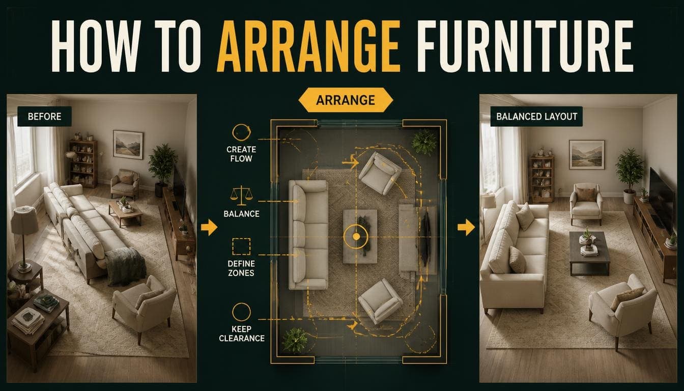
3. Create a Zone, Not a Perimeter
Seating should face inward toward a shared centre — a coffee table, a rug, or simply each other.
The test: could four people hold a conversation without raising their voices or turning their heads awkwardly? If not, the arrangement is too spread out.
4. Leave a Clear Entry Path
There should be an unobstructed route from the room's entrance to the other doorways.
Furniture blocking that path reads as impractical immediately, even in a photograph.
5. Vary the Height
An arrangement where everything is the same height reads as flat. A floor lamp, a tall plant, or artwork hung above seating gives the eye vertical movement.
6. Scale to the Room
Oversized furniture in a small room fills the frame. Undersized furniture in a large room looks lost.
| Room size | Sofa | Coffee table | Rug |
|---|---|---|---|
| Under 15 m² | Loveseat | Small round | 120×170cm |
| 15–25 m² | 3-seat | Rectangular | 160×230cm |
| Over 25 m² | Sectional or two sofas | Large or two | 200×300cm+ |
Rug Sizing
Rugs get sized wrong more often than any other element, and an undersized rug undermines an otherwise good arrangement.
Living Room
Best: All furniture legs on the rug. Requires a large rug and a room that can take it.
Standard: Front legs of all seating on the rug. This is the most common correct approach.
Minimum: Rug extends at least 15cm beyond the coffee table on all sides, and touches the front legs of the sofa.
Wrong: A rug that sits only under the coffee table, touching nothing else. It reads as a placemat.
Dining Room
The rule: the rug should extend at least 60cm beyond the table edge on all sides — enough that chairs remain on the rug when pulled out.
A rug where chairs come off the edge when in use is undersized regardless of how it looks when the chairs are tucked in.
Bedroom
Option 1: Large rug extending 60cm beyond the bed on three sides.
Option 2: Rug placed under the lower two-thirds of the bed, extending past the sides.
Option 3: Runners on each side of the bed. Best for small rooms where a full rug would cover almost all visible floor.
Try DecoAI Free
3 free credits. No credit card needed. Stage any room in 30 seconds.
Get 3 Free CreditsRoom-by-Room Arrangements
Living Room
The standard arrangement: Sofa facing the focal point, two chairs perpendicular or opposite, coffee table centred, rug anchoring all of it.
Clearances: 90cm main walkway, 40–45cm sofa to coffee table.
Common problem: furniture against all four walls. Pull the seating inward.
For long narrow rooms: consider two zones rather than one — a main seating area and a secondary reading corner or desk.
Bedroom
Bed placement: Against the longest uninterrupted wall. Not under a window if there's an alternative. Not directly facing the door.
Clearances: 60–75cm on both sides of the bed. 90cm at the foot if there's a walkway.
Bedside tables: Both sides. A single table reads as a constraint rather than a choice.
Common problem: too much furniture. A bed, two bedside tables, and one other piece is enough for most bedrooms.
Dining Room
Table placement: Centred in the room, or centred under the light fixture if that's fixed.
Clearances: 90cm from table edge to wall on all sides, minimum 75cm.
Lighting: Pendant centred over the table, not the room. Hung 75–85cm above the table surface.
Common problem: a table sized to the room's maximum capacity rather than to comfortable clearance. Show a table for six with 90cm clearance rather than eight with 60cm.
Home Office
Desk placement: Perpendicular to the window so light falls across the surface. Not backing onto it — that creates glare.
Clearances: 70–90cm between desk edge and the wall behind for the chair.
Common problem: desk shoved into a corner facing a blank wall. Functional but reads as an afterthought.
Open-Plan Spaces
The hardest arrangement problem, because there are no walls to define zones.
Three tools:
- Rugs — Each zone gets its own rug, which defines its floor area
- Furniture backs — A sofa's back creates a soft boundary between living and dining
- Lighting — A pendant over the dining table separates it visually from the kitchen
Common problem: furniture floating in the middle of a large space with no defining elements. It reads as unfinished rather than open.
Arrangements That Fail
Everything Against the Walls
The most common error. Produces a hollow centre and a room that feels like a waiting area.
Seating Too Far Apart
Beyond 2.5m, seating stops reading as a conversation area.
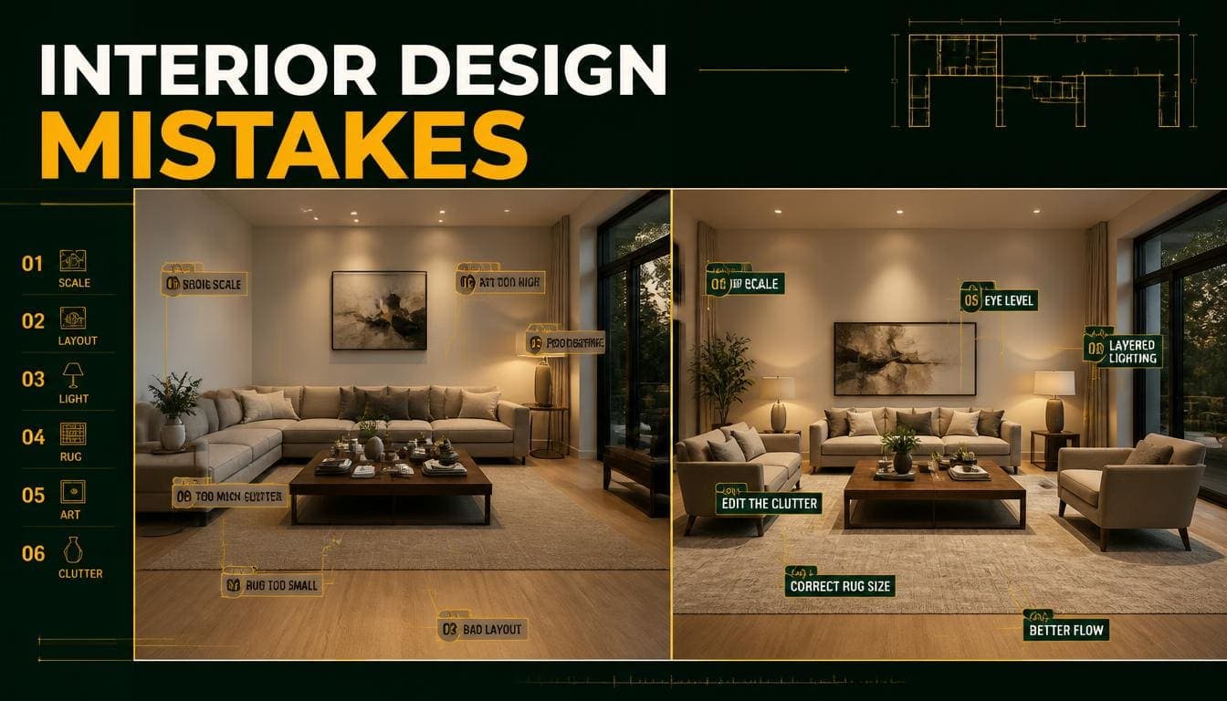
Rug Too Small
An undersized rug undermines the whole arrangement. It should touch at least the front legs of the seating.
Blocking the Walkway
Furniture obstructing the route between doorways reads as impractical immediately.
Ignoring the Focal Point
Seating that faces nothing in particular feels arbitrary.
Everything the Same Height
Flat. Add a floor lamp, a tall plant, or artwork above the seating.
Too Many Pieces
Every additional item reduces visible floor. Three well-placed pieces beat six crowded ones.
Symmetry in Asymmetric Rooms
Forcing a symmetrical arrangement into a room with an off-centre door or window produces a layout that fights the architecture.
Assessing a Staged Image
The same rules apply when reviewing AI-generated staging. Check:
Clearances — Is there visible floor between furniture and walls? Between pieces?
Walkway — Is there a clear path from the doorway through the room?
Focal point — Does the seating face the window, fireplace, or a sensible centre?
Rug size — Does it touch at least the front legs of the seating?
Scale — Is the sofa plausible relative to the door frame?
Density — Does the room look workable or packed?
If a generated arrangement fails several of these, regenerate. Layout quality varies meaningfully between attempts.
Frequently Asked Questions
How much space should be between a sofa and coffee table?
40–45cm. Close enough to reach comfortably, far enough to walk past.
How wide should a walkway be?
75cm minimum, 90–110cm comfortable for main circulation routes.
Should furniture be against the wall?
Usually not. Pulling seating inward, even 15–20cm, creates a defined zone and makes rooms look larger. The exception is very small rooms where clearance is already tight.
What size rug do I need for a living room?
Large enough that at least the front legs of all seating rest on it. A rug sitting only under the coffee table is undersized.
What size rug for a dining table?
Extending at least 60cm beyond the table edge on all sides — enough that chairs stay on the rug when pulled out.
How far apart should seating be?
Under 2.5 metres for a conversation area. Beyond that, the arrangement stops reading as a grouping.
Where should a bed go?
Against the longest uninterrupted wall, ideally not under a window and not directly facing the door. Leave 60–75cm clear on both sides.
How do I arrange an open-plan space?
Use rugs to define each zone, a sofa back as a soft boundary, and a pendant light over the dining table to separate it from the kitchen.
How much furniture should a room have?
Enough to demonstrate function without hiding floor. For a medium living room: sofa, two chairs, coffee table, rug, one or two lamps.
Summary
The measurements: 75cm minimum walkway, 90cm comfortable. 40–45cm sofa to coffee table. 60–75cm around a bed. 90cm around a dining table.
The principles: Find the focal point, pull furniture off the walls, create an inward-facing zone, keep the entry path clear, vary the height, scale to the room.
Rug sizing: Front legs of seating on the rug. 60cm beyond a dining table on all sides.
The most common failure: everything pushed against the walls. Pulling seating inward is the single change that improves most arrangements.
Check the layout in your staged images. DecoAI gives 3 free credits with no card required — generate three variations and pick the one where the clearances actually work.