Most art in most homes is hung too high. It's the single most common error in interior decoration, and it's entirely a measurement problem — which means it's straightforward to fix.
This covers the heights and spacings that govern picture hanging, how to size art relative to furniture, and how to plan a gallery wall that reads as designed rather than accumulated.
The Height Rule
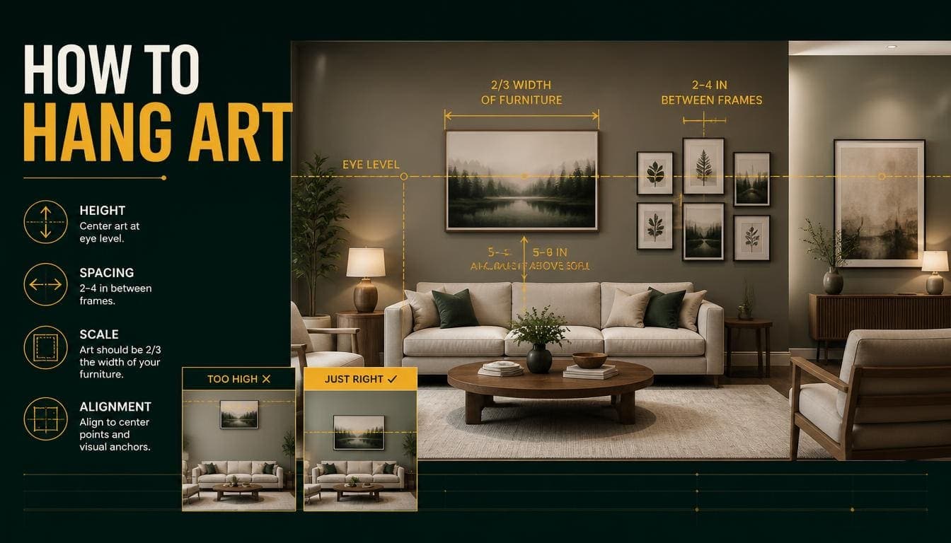
Centre at 145–155cm
The centre of the artwork should sit roughly 145–155cm from the floor. Around 150cm is the standard.
That's average eye level, and it's the convention galleries and museums use.
Note this is the centre of the piece, not the top or the hanging hook. Getting this wrong is why so much art ends up too high.
Why Art Ends Up Too High
People align it with furniture tops. A picture hung level with the top of a tall bookcase will be far above eye level.
People use existing hooks. Whatever height the previous occupant chose gets inherited.
People hang from the top edge. Measuring down from the ceiling rather than up from the floor.
Rooms with high ceilings tempt overcompensation. The instinct to fill vertical space pushes art upward. Resist it — eye level doesn't change with ceiling height.
The Calculation
To find the hook position:
- Measure the artwork's height and halve it
- Add 150cm
- Subtract the distance from the top of the frame to the hanging wire when taut
Example: a 60cm-tall painting with the wire sitting 10cm below the frame top.
- Half the height: 30cm
- Plus 150: 180cm
- Minus wire drop: 170cm
The hook goes at 170cm.
Try DecoAI Free
3 free credits. No credit card needed. Stage any room in 30 seconds.
Get 3 Free CreditsHanging Above Furniture
Different rule, because the art relates to the furniture rather than to the room.
The Gap
15–25cm between the top of the furniture and the bottom of the frame.
Closer than 15cm and the two elements read as merged. More than 25cm and they read as unrelated.
Above a Sofa
Width: the artwork should be roughly two-thirds the width of the sofa.
A 200cm sofa suits artwork around 130–140cm wide — either a single large piece or a group that spans that width.
What fails: a small piece centred above a large sofa. It reads as an afterthought.
Above a Console or Sideboard
Width: the same width as the furniture or slightly narrower. Never wider.
Gap: 15–25cm.
Above a Bed
Width: roughly two-thirds the width of the bed.
Height: the gap can be slightly larger here — 20–30cm — because headboards vary.
Practical note: anything heavy above a bed needs proper fixing.
Above a Fireplace
Width: roughly two-thirds to three-quarters the mantel width.
Height: 10–20cm above the mantel shelf.
The exception to the 150cm rule: fireplace proportions govern here rather than eye level.
Sizing Art to Walls
For a Blank Wall
Artwork should occupy roughly 60–75% of the available wall width.
Smaller than that and it floats. Larger and it crowds.
The Common Failure
Undersized art is far more common than oversized. A small piece on a large wall reads as tentative.
The practical fix: if a single piece isn't large enough, group several to occupy the space collectively.
Gallery Walls
The most requested arrangement and the easiest to get wrong.
Plan Before Hanging
On the floor first. Lay the pieces out on the floor in the arrangement you're considering, and adjust until it works. Far easier than adjusting on the wall.
Or use paper templates. Cut paper to the size of each frame and tape them to the wall. Move them until the arrangement reads correctly, then hang.
This takes twenty minutes and saves a wall full of unnecessary holes.
Spacing
5–8cm between frames. Consistent throughout.
Tighter than 5cm and the pieces merge. Wider than 8cm and the group loses cohesion and reads as separate items.
The Centre Rule Still Applies
The centre of the whole arrangement sits at 145–155cm, treating the group as a single unit.
Layout Approaches
Grid — Equal-sized frames in even rows and columns. The most formal and the easiest to execute well. Suits Modern, Minimalist, and Contemporary.
Salon hang — Densely packed, mixed sizes, filling a wall from a defined boundary. Suits Traditional, Bohemian, and Maximalist.
Linear — A single row at consistent centre height. Works in hallways and above long furniture.
Organic cluster — Irregular arrangement around a central anchor piece. Hardest to execute; needs a clear structure underneath the apparent randomness.
Making a Cluster Work
Start with the largest piece, positioned slightly off-centre.
Build outward, balancing visual weight rather than size. A small dark piece has similar weight to a larger pale one.
Keep one alignment. Either a consistent top line, bottom line, or a central horizontal axis running through the arrangement. Without one, the group reads as scattered.
Define the outer boundary. A gallery wall should have a recognizable shape — usually a rectangle. Pieces that stray outside it break the arrangement.
Frame Consistency
Easiest approach: all frames in the same finish, different sizes.
Also works: two finishes alternating, or mixed frames with consistent mounts.
Hardest: every frame different in both finish and style. It can work but requires the content to unify what the frames don't.
Art by Room
Living Room
The main wall — usually above the sofa or opposite the entrance — takes the largest piece or the gallery wall.
Sizing: two-thirds the sofa width.
Bedroom
One piece above the bed, or a pair.
Register: calm. Bedrooms suit quieter work than living rooms.
Hallway
The natural home for a linear arrangement or a gallery wall, since hallways are narrow and viewed while moving.
Height: consistent centre line at 150cm.
Dining Room
One substantial piece, often on the wall opposite the main seating.
Note: dining rooms tolerate more dramatic work than living rooms, because they're used briefly.
Stairwells
The hardest location. Art should follow the stair angle, with each piece's centre 145–155cm above the tread directly below it.
The common error: hanging at a consistent height from the floor below, which produces an arrangement that ignores the stairs.
Common Mistakes
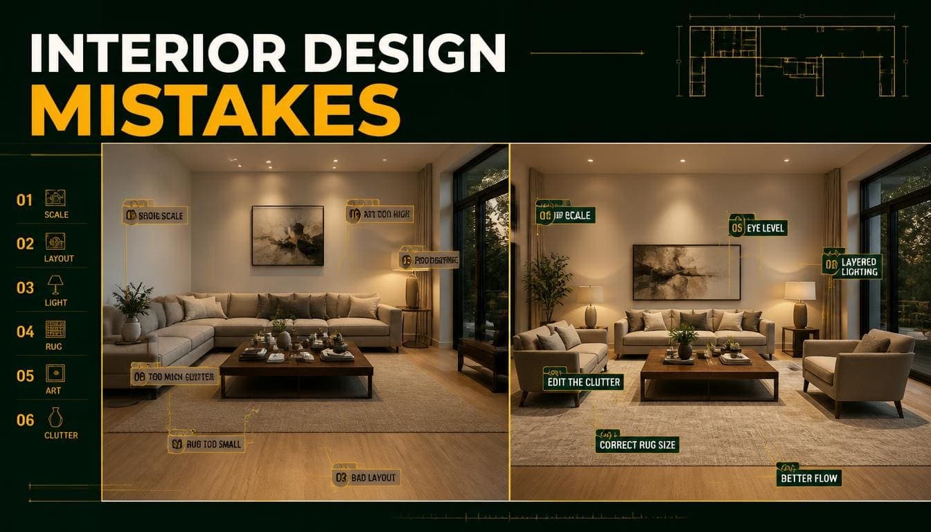
1. Hanging Too High
The defining error. Centre at 150cm, not aligned with furniture tops or ceiling.
2. Art Too Small for the Wall
More common than oversizing. Aim for 60–75% of the available wall width.
3. Art Too Small Above a Sofa
Should be roughly two-thirds the sofa width. A small piece above a large sofa reads as an afterthought.
4. Inconsistent Gallery Spacing
5–8cm throughout. Varied spacing reads as accidental.
5. No Alignment in a Cluster
Every gallery wall needs one consistent line — top, bottom, or central axis.
6. Hanging Before Planning
Twenty minutes with paper templates saves a wall full of holes.
7. Ignoring the Furniture Relationship
Art above furniture relates to the furniture. Art on a blank wall relates to the wall. Different rules.
8. Overcompensating for High Ceilings
Eye level doesn't change with ceiling height. Art hung high to "fill" a tall wall just ends up too high.
For Property Presentation
What to Do Before Photographing
Check the height. Art hung too high is visible in photographs and reads as amateur.
Reduce the quantity. Fewer, larger pieces photograph better than many small ones. A wall with three pieces reads as considered; a wall with eleven reads as busy.
Remove personal content. Family photographs, certificates, and children's artwork all interrupt a buyer's ability to imagine themselves in the space.
Straighten everything. Slightly crooked frames are highly visible in photographs and invisible in person.
What Works in Listing Photos
One large abstract piece above the sofa. Neutral, non-divisive, and it fills the wall properly.
A simple grid of two or four matching frames.
Nothing — a bare wall photographs better than a badly arranged one.
The Staging Note
AI staging generates artwork as part of most schemes. Two things to check:
Height — generated art is usually correctly placed, but check it isn't floating oddly relative to furniture.
Quantity — some styles generate dense gallery walls. In Contemporary and Scandinavian staging, that's usually overstyling. Regenerate if the wall looks busy.
Frequently Asked Questions
How high should you hang art?
Centre the piece at 145–155cm from the floor — around 150cm is standard. This is the centre of the artwork, not the top or the hook.
How high above a sofa should art hang?
15–25cm between the top of the sofa and the bottom of the frame.
What size art above a sofa?
Roughly two-thirds the width of the sofa. A 200cm sofa suits art around 130–140cm wide.
How much space between frames in a gallery wall?
5–8cm, consistent throughout. Tighter and pieces merge; wider and the group loses cohesion.
How do I plan a gallery wall?
Lay the pieces out on the floor first, or cut paper templates to size and tape them to the wall. Adjust until it reads correctly, then hang.
Should art be centred on the wall or on the furniture?
On the furniture, if it's above furniture. On the wall, if the wall is otherwise blank.
How high should art be in a stairwell?
Follow the stair angle, with each piece's centre 145–155cm above the tread directly below it — not at a consistent height from the floor below.
Does ceiling height change how high to hang art?
No. Eye level is eye level. High ceilings tempt people to hang higher, which is the most common cause of art being too high.
How much art should a room have?
Fewer, larger pieces generally outperform many small ones — particularly in photographs. One substantial piece per main wall is usually enough.
Summary
Height: centre at 145–155cm. This is the rule most commonly broken.
Above furniture: 15–25cm gap, and roughly two-thirds the furniture width.
On a blank wall: 60–75% of the available wall width.
Gallery walls: 5–8cm spacing throughout, one consistent alignment, a defined outer boundary, and the whole group centred at 150cm.
Before hanging: plan on the floor or with paper templates. Twenty minutes saves a wall full of holes.
For photographs: fewer and larger, straight, and nothing personal.
Check the art in staged images. DecoAI gives 3 free credits with no card required — worth reviewing generated walls for overstyling, which is a common artifact in denser styles.