Paint is the cheapest way to change a room and the most commonly got wrong. The reason is consistent: colour behaves differently at home than it does on a chip, in a showroom, or on a screen.
A grey that looked warm in the shop turns blue on a north-facing wall. A white that seemed neutral reads yellow under warm bulbs. Neither is a bad colour — they're being viewed under different conditions than they were chosen under.
This covers why that happens, how to test properly, and how to choose in a way that survives contact with your actual room.
Why Colour Changes
Light Temperature
The colour of the light hitting a wall shifts how the paint reads.
North-facing rooms receive cool, blue-toned light. Colours read cooler and slightly greyer than the sample suggests.
South-facing rooms receive warm light for most of the day. Colours read warmer and brighter.
East-facing rooms are warm in the morning, cooler after midday.
West-facing rooms are cooler in the morning, warm in the afternoon and evening.
The practical implication: the same paint in a north-facing and a south-facing room in the same house will look like two different colours.
Artificial Light
Bulb colour temperature shifts paint substantially.
2700K warm white pushes colours yellow and warm. 4000K cool white pushes colours blue and flat.
A room chosen under showroom lighting — usually cool and very bright — will look different under domestic warm bulbs.
Surrounding Colours
Paint reflects off adjacent surfaces. A wall next to a large green lawn picks up green in daylight. A wall opposite a red sofa picks up warmth.
Sheen
The same colour in matt, eggshell, and gloss reads as three different shades. Higher sheen reflects more light and appears lighter and slightly cooler.
Try DecoAI Free
3 free credits. No credit card needed. Stage any room in 30 seconds.
Get 3 Free CreditsUndertones
The most useful concept in choosing paint and the least discussed.
What They Are
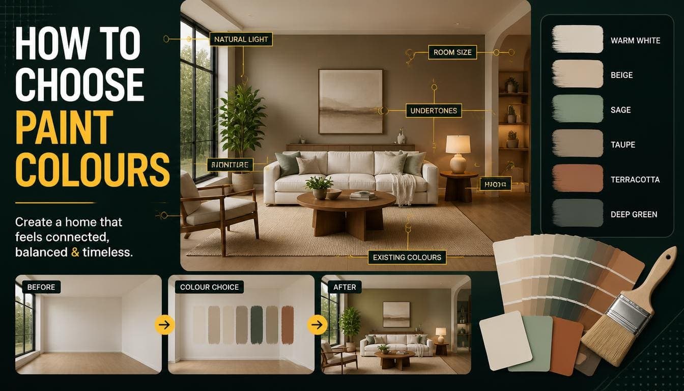
Almost no paint is truly neutral. Whites, greys, and beiges all carry a bias toward another colour — the undertone.
Common undertones:
- Warm: yellow, red, pink
- Cool: blue, green, violet
A grey with a blue undertone and a grey with a green undertone will look completely different on a wall, despite appearing similar on a chip.
How to Identify Them
Compare against pure white. Put the sample next to a sheet of printer paper. The bias becomes obvious.
Compare samples against each other. Three greys side by side reveal which is blue, which is green, and which is warm.
Look at the darkest shade on the same paint card. Manufacturers usually print a colour family on one card. The darkest version shows the undertone most clearly.
Why They Matter
Undertones need to work with the room's fixed elements. Warm oak flooring against a blue-grey wall produces a clash. Against a warm greige, it works.
Undertones need to be consistent. A warm white on the walls and a cool white on the trim reads as an error, even to people who can't identify it.
Testing Properly
The step that prevents most paint mistakes, and the one people skip.
Don't Judge From a Chip
A 5cm square gives almost no information. Colour appears more intense over a large area, and a chip held against a wall is surrounded by the existing colour, which distorts it.
Test Large
Minimum A4 size, ideally A3 or larger.
Two coats, so it's the actual finished colour rather than a thin wash.
Test on Board, Not the Wall
Paint sample boards rather than patches directly on the wall.
Why: you can move a board around the room and see the colour on different walls at different times. A patch on the wall is fixed, and it's surrounded by the old colour which distorts perception.
Practical: primed hardboard or heavy card from an art shop.
Test in Position
On each wall — a north wall and a south wall in the same room will show the colour differently.
Beside the fixed elements — hold the board against the flooring, the worktop, the tile, and the trim. That's what the colour has to work with.
Beside the window and away from it — the difference across a room is substantial.
Test Over Time
Look at it in morning light, midday, afternoon, and under artificial light at night.
A colour that works at 2pm and looks wrong at 8pm is a colour you'll dislike every evening.
Minimum: 24 hours. Preferably two or three days.
Choosing Whites
The most-bought and most-returned paint category.
There's No Neutral White
Every white has an undertone. The question is which one suits the room.
Warm Whites
Undertones of yellow, cream, or red.
Work in: north-facing rooms, where they counteract cool light. Period properties. Rooms with warm timber or brass.
Fail in: south-facing rooms, where warm light plus warm paint reads as yellow.
Cool Whites
Undertones of blue or grey.
Work in: south-facing rooms with abundant warm light. Contemporary properties. Rooms with cool grey flooring or chrome fittings.
Fail in: north-facing rooms, where they read as cold and slightly blue.
Neutral-Leaning Whites
Minimal undertone in either direction.
The safest default when you're unsure, though they can read as slightly flat in rooms with very warm or very cool light.
The Practical Rule
North-facing: warm white. South-facing: cool or neutral white. East and west: neutral, or match to the time of day the room is used most.
Try DecoAI Free
3 free credits. No credit card needed. Stage any room in 30 seconds.
Get 3 Free CreditsChoosing Greys and Neutrals
The Current Position
Cool blue-grey dominated the 2010s and now reads as dated. Rooms painted in it register as being of that period.
Warm greige and mushroom have replaced it. Grey with a warm undertone rather than a blue one.
Testing Greys
Greys show undertones more strongly than any other colour family. A grey that seems neutral on a chip will frequently read distinctly blue, green, or purple on a wall.
Test at least three side by side. The differences that are invisible on chips become obvious at scale.
For North-Facing Rooms
Cool greys in north-facing rooms are the most common paint mistake. The cool light plus the cool paint produces something distinctly blue and unwelcoming.
Use warm greige instead, or a warm white.
Paint Finishes
The finish affects durability, appearance, and how the colour reads.
| Finish | Sheen | Durability | Best for |
|---|---|---|---|
| Matt | None | Low | Ceilings, low-traffic walls |
| Chalk / flat matt | None | Very low | Feature walls, period rooms |
| Eggshell | Low | Moderate | Walls, trim, most rooms |
| Satin | Medium | Good | Trim, kitchens, bathrooms |
| Semi-gloss | High | Very good | Trim, doors, high-moisture |
| Gloss | Very high | Very good | Trim, doors, radiators |
Practical Guidance
Walls in living areas and bedrooms: matt or eggshell. Matt hides imperfection better; eggshell is more washable.
Walls in kitchens and bathrooms: eggshell or satin. Moisture and cleaning require durability.
Trim, doors, and skirting: eggshell, satin, or semi-gloss.
Ceilings: matt. Any sheen shows every imperfection.
The Seamless Approach
For a seamless look, paint walls and trim the same colour in different finishes — matt on walls, eggshell on trim.
This removes the visual line at every skirting board and door frame, which makes rooms look taller.
Colour by Room
Living Room
Safe: warm white, greige, or a soft muted tone.
Consider: the room's orientation and the flooring's undertone before anything else.
Bedroom
Safe: warm white, soft neutral, or a muted calm colour — sage, dusty blue, warm grey.
Avoid: bright or saturated colours. Bedrooms sell on calm.
Kitchen
Usually determined by the cabinets. Wall colour should complement rather than compete.
Safe: warm white or a very soft neutral.
Bathroom
Safe: white or very pale neutral.
Practical: eggshell or satin finish for moisture resistance.
Hallway
Usually the darkest space with no natural light.
Safe: the lightest colour in the property. Warm white almost always.
Consider: hallways connect to every other room, so the colour has to work alongside all of them.
Home Office
Safe: neutral, or a slightly deeper tone.
Consider: deeper colours — navy, olive — work well here and read as focused.
For Property Presentation
Should You Repaint Before Selling?
Worth it: any room with a strong or divisive colour. Deep red, bright yellow, purple, or a strong feature wall.
Cost: $100–$200 per room in materials.
Not worth it: rooms that are simply a bit tired in a neutral colour. Cleaning marks and touching up beats a full repaint.
What Colour to Repaint
Warm white or a very soft neutral. The objective is to let buyers project their own preferences, which a neutral allows and a strong colour doesn't.
Not stark white. It reads as clinical and shows every imperfection.
The Trim Question
Matching trim to walls produces a seamless, contemporary result.
Contrasting white trim is the conventional approach and reads as more traditional.
Either works. Consistency across the property matters more than which you choose.
Common Paint Mistakes
1. Choosing From a Chip
A 5cm square gives almost no useful information. Test large.
2. Testing on the Wall
The surrounding old colour distorts perception. Test on boards you can move.
3. Ignoring Orientation
North-facing rooms need warmer colours than south-facing ones. The same paint reads differently in each.
4. Cool Grey in North-Facing Rooms
The most common single mistake. Cool light plus cool paint reads distinctly blue.
5. Not Checking Against Fixed Elements
The flooring, worktop, and tile aren't changing. The paint has to work with them.
6. Mixing Undertones
Warm white walls with cool white trim reads as an error even when neither colour is wrong.
7. Wrong Finish
Matt in a bathroom fails. Gloss on an imperfect wall highlights every flaw.
8. Judging Under Showroom Lighting
Showrooms use bright cool light. Domestic rooms don't.
Frequently Asked Questions
How do I choose the right paint colour?
Test large samples on movable boards, in position against the room's fixed elements, viewed at different times of day and under artificial light. Judge over at least 24 hours.
Why does paint look different at home?
Light temperature, room orientation, surrounding colours, and finish all shift how a colour reads. Showroom lighting is brighter and cooler than domestic lighting.
What are undertones?
The colour bias in an apparently neutral paint — whites, greys, and beiges all lean warm or cool. Comparing against pure white reveals them.
What white should I use in a north-facing room?
A warm white. Cool whites in north-facing rooms read as cold and slightly blue because the natural light is already cool.
Is grey still in style?
Cool blue-grey reads as dated. Warm greige and mushroom tones have replaced it and remain current.
What paint finish should I use on walls?
Matt or eggshell in living areas and bedrooms. Eggshell or satin in kitchens and bathrooms where moisture and cleaning require durability.
Should trim match the walls?
Matching produces a seamless, contemporary result and makes rooms look taller. Contrasting white trim is the traditional approach. Either works; consistency across the property matters more.
How large should a paint sample be?
A4 minimum, A3 or larger preferably, painted in two coats on a movable board.
Should I repaint before selling?
Rooms with strong or divisive colours, yes — $100–$200 per room. Rooms that are simply tired in a neutral, no. Cleaning and touching up is enough.
Summary
Why colour changes: light temperature, orientation, surrounding colours, and finish all shift how paint reads.
Undertones: every neutral leans warm or cool. Identify it by comparing against pure white, and match it to the room's fixed elements.
Testing: A4 minimum, two coats, on movable boards, in position, over at least 24 hours.
By orientation: warm whites in north-facing rooms, cool or neutral in south-facing.
The most common mistake: cool grey in a north-facing room. Cool light plus cool paint reads distinctly blue.
Before selling: repaint strong or divisive colours only. Warm white or a soft neutral.
See how colour reads in your room. DecoAI gives 3 free credits with no card required — worth comparing a warm and a cool palette in the same space before committing to tins.