Coastal interior design has a reputation problem. The version most people picture — rope, driftwood signs, ship wheels, seashells in glass jars — is a decorating theme, not a design style, and it looks like a gift shop.
Actual coastal design is about light, air, and natural texture. It borrows from the environment rather than illustrating it.
This covers the three main variations, the palettes that work, and where the style genuinely fits.
What Coastal Design Actually Is
The Core Idea
Coastal interiors take their cues from the conditions of coastal living rather than from nautical objects.
What that means in practice:
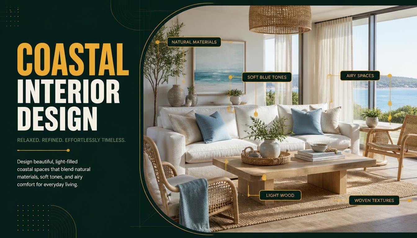
Light maximized — Windows unobstructed, pale reflective surfaces, minimal heavy furnishing.
Air and openness — Uncluttered rooms, negative space, furniture that doesn't block sightlines.
Natural texture — Linen, rattan, jute, unfinished timber, woven fibre.
Bleached palettes — Colours as though faded by sun and salt rather than freshly applied.
Durability implied — Materials that suggest they can handle sand, water, and use.
Indoor-outdoor continuity — Where the property allows, minimal distinction between inside and outside spaces.
What It Isn't
Nautical decoration. Anchors, ropes, ship wheels, lighthouse motifs, and seashell arrangements are theming rather than design, and they read as such immediately.
The distinction: coastal design suggests the environment. Nautical decoration illustrates it.
Try DecoAI Free
3 free credits. No credit card needed. Stage any room in 30 seconds.
Get 3 Free CreditsThe Three Variations
1. Hamptons
The most formal coastal style, originating in the American northeast.
Characteristics:
- Crisp white walls and trim
- Navy and pale blue as the primary accents
- Shiplap or panelled walls
- Upholstered furniture in white or navy linen
- Wicker and rattan as texture, used sparingly
- Brass or nickel hardware
- Larger, more formal proportions
Register: Polished, established, slightly grand. The most expensive-looking coastal variation.
Best for: Larger properties, higher price points, and markets where a more formal register suits.
The caution: Hamptons became very prominent in the 2010s and the heavily styled version — navy and white stripes, oversized lanterns, "beach" signage — now dates.
2. Mediterranean Coastal
Drawn from Greece, southern Italy, and the Balearics.
Characteristics:
- Whitewashed or lime-plastered walls
- Terracotta and clay tones
- Stone and tile flooring
- Wrought iron
- Olive and sage green
- Deep-set windows, arched openings where the architecture allows
- Simple, almost rustic furniture
Register: Warmer and more rustic than Hamptons. Less polished, more sun-bleached.
Best for: Properties with stone or plaster walls, warmer climates, and anywhere the architecture supports it.
The distinction from Hamptons: Mediterranean is warm, earthy, and textural. Hamptons is cool, crisp, and formal.
3. Modern Coastal
The contemporary interpretation and the most broadly usable.
Characteristics:
- Warm white walls
- Pale timber
- Linen and cotton in neutral tones
- One muted accent — soft blue, sage, or sand
- Contemporary furniture forms
- Almost no pattern
- Very few decorative objects
Register: Calm, light, uncluttered. Reads as Scandinavian with a warmer, sandier palette.
Best for: The widest range of properties. Works away from the coast in a way the other two don't.
Why it's the most useful: it carries coastal's lightness without the regional signals that make Hamptons and Mediterranean property-dependent.
Comparing the Three
| Factor | Hamptons | Mediterranean | Modern Coastal |
|---|---|---|---|
| Palette | White, navy, pale blue | White, terracotta, olive | Warm white, sand, muted blue |
| Temperature | Cool | Warm | Neutral-warm |
| Formality | High | Low | Moderate |
| Texture | Moderate | High | Moderate |
| Pattern | Stripes, some | Minimal | Almost none |
| Property-dependent | High | Very high | Low |
| Dates quickly | Yes, if over-styled | No | No |
The Coastal Palette
Base Colours
- Warm white — the dominant wall colour across all three variations
- Sand and oatmeal — for upholstery and textiles
- Pale grey with a warm undertone — for larger pieces
- Bleached timber — floors and furniture
Accent Colours
Modern coastal and Mediterranean:
- Muted sea blue — greyed rather than bright
- Sage and olive green
- Soft terracotta
- Sand and taupe
Hamptons specifically:
- Navy
- Pale sky blue
- White as an active colour rather than just a base
What Coastal Avoids
Bright turquoise and aqua. The most common error. Real coastal palettes are muted and bleached; bright tropical blues read as theming.
Cool grey. Coastal palettes lean warm. Cool grey makes rooms feel like winter rather than summer.
High contrast. Except in Hamptons, where navy against white is characteristic.
Anything glossy. Matte and chalky finishes suit the register; high gloss doesn't.
Try DecoAI Free
3 free credits. No credit card needed. Stage any room in 30 seconds.
Get 3 Free CreditsMaterials and Texture
Texture carries coastal design more than colour does.
Core Materials
Linen — The defining coastal fabric. Loose weave, natural drape, in white, oatmeal, or muted blue.
Rattan and cane — Chairs, light shades, headboards. Used as accent rather than throughout.
Jute and sisal — Rugs, most commonly. Adds texture underfoot without adding colour.
Bleached or pale timber — Floors, furniture, and beams. Oak, ash, or driftwood-toned finishes.
Stone — Particularly in Mediterranean coastal. Floors, worktops, and walls.
Woven fibre — Baskets and storage. One or two per room, not a collection.
Cotton — Slipcovers, bedding, curtains. Washable, which fits the practical register.
Materials to Avoid
Dark polished hardwood — reads as formal and inland.
Velvet and heavy upholstery — too plush for the register.
Chrome and high-gloss metal — brass, nickel, and matte black work better.
Synthetic-looking materials — the whole style depends on materials looking natural.
Coastal by Room
Living Room
Furniture: Slipcovered sofa in white or oatmeal linen, one rattan or cane chair, light timber coffee table
Palette: Warm white walls, natural textiles, one muted blue or sage accent
Textiles: Jute rug, linen cushions, a lightweight throw
Lighting: Rattan or fabric pendant, simple table lamps
Detail: One or two natural objects — a large plant, a woven basket. Not a shelf of shells.
Bedroom
Furniture: Low timber or rattan bed frame, simple bedside tables
Palette: Warm white walls, white or oatmeal linen bedding
Textiles: Linen throughout, one lightweight blanket in a muted tone
Lighting: Simple bedside lamps with linen or rattan shades
Detail: Sheer or light linen curtains. Heavy curtains fight the register entirely.
Kitchen
Cabinets: White or pale timber, shaker or flat-front
Worktops: Pale stone, or timber in Mediterranean coastal
Detail: Open shelving with a few ceramics, woven pendant lights
Hardware: Brass, nickel, or matte black
Bathroom
The room where coastal works most naturally, since the material palette suits wet environments anyway.
Surfaces: Pale tile, stone, or microcement
Fittings: Simple, in brass or matte black
Detail: White cotton towels, one plant, a timber stool
Avoid: Nautical anything. This is where seashell soap dishes appear and where they look worst.
Outdoor Spaces
Coastal design extends outside more naturally than most styles.
Furniture: Rattan or teak, cushions in outdoor linen
Detail: Lanterns, potted plants, an outdoor rug in jute-look synthetic
Where Coastal Works
Genuinely Coastal Properties
The obvious case. Properties with sea views, beach access, or in coastal towns.
Properties With Good Natural Light
The style depends on light. A bright property away from the coast can carry modern coastal comfortably.
Holiday Lets and Second Homes
Coastal signals relaxation and holiday, which is exactly the register for short-term rental marketing.
Warmer Climates
Mediterranean coastal particularly. The palette and materials suit hot conditions.
Small Bright Rooms
The pale palette and light furniture make compact spaces feel larger, similarly to Scandinavian.
Where It Doesn't
Dark Properties
Coastal depends on light. In a north-facing room with small windows, the pale palette goes grey and flat.
Urban Properties Far From Water
Reads as aspirational rather than appropriate. Modern coastal can bridge; Hamptons and Mediterranean can't.
Period Properties With Formal Architecture
Victorian or Georgian formality fights coastal's relaxed register.
Cold Climates
Not fatal, but the style reads as summer. In a property that will mostly be viewed in winter, warmer styles may perform better.
Premium Urban Markets
Coastal signals relaxed rather than impressive. At high urban price points, it can undersell.
Avoiding the Cliché
The single biggest risk with this style.
What Reads as Theming
- Seashells in glass jars or bowls
- Rope details on anything
- Ship wheels, anchors, lifebuoys
- Signs with words like "Beach" or "Ocean"
- Navy and white stripes on multiple surfaces
- Coral and starfish ornaments
- Anything in bright turquoise
- Lighthouse motifs
What Reads as Design
- Linen slipcovers
- One rattan chair
- A jute rug
- Bleached timber
- Muted blue on one element
- A single large plant
- Sheer white curtains
- Uncluttered surfaces
The test: would this object be here if the property weren't near the sea? If it only makes sense as a reference to the coast, it's theming.
Frequently Asked Questions
What is coastal interior design?
A style drawing on the conditions of coastal living — maximized light, natural texture, bleached palettes, and openness — rather than on nautical decoration.
What's the difference between coastal and nautical?
Coastal design suggests the environment through light, texture, and palette. Nautical decoration illustrates it with ropes, anchors, and shells. The second reads as theming.
What colours are coastal?
Warm white, sand, oatmeal, and bleached timber as the base. Muted sea blue, sage, and soft terracotta as accents. Bright turquoise reads as theming rather than coastal.
What's Hamptons style?
The most formal coastal variation — crisp white, navy accents, shiplap or panelling, upholstered furniture, and larger proportions. Originated in the American northeast.
What's Mediterranean coastal?
Warmer and more rustic — whitewashed or plastered walls, terracotta and clay, stone floors, wrought iron, and olive green. Drawn from Greece, southern Italy, and the Balearics.
Can I use coastal style away from the coast?
Modern coastal, yes — it reads as light and calm rather than as a location reference. Hamptons and Mediterranean depend more on context.
Does coastal work in small rooms?
Yes, if the light is good. The pale palette and light furniture make compact spaces feel larger, similarly to Scandinavian.
What should I avoid in coastal design?
Seashells, rope, anchors, ship wheels, word signs, bright turquoise, and navy-and-white stripes on multiple surfaces. All read as theming.
What's the most versatile coastal variation?
Modern coastal. It carries the lightness without the regional signals that tie Hamptons and Mediterranean to specific contexts.
Summary
What it is: light, air, and natural texture drawn from coastal conditions — not nautical objects.
Three variations: Hamptons (formal, white and navy), Mediterranean (warm, terracotta and stone), modern coastal (calm, warm neutral, most versatile).
The palette: warm white and sand as base, muted blue and sage as accents. Bright turquoise reads as theming.
Where it works: coastal properties, bright rooms anywhere, holiday lets, warm climates, and small bright spaces.
Where it fails: dark rooms, formal period properties, and premium urban markets.
The test that prevents clichés: would this object be here if the property weren't near the sea? If not, it's theming.
Test coastal against a neutral alternative. DecoAI gives 3 free credits with no card required — enough to compare a coastal direction against Scandinavian in the same room.