How to Design Seamless Interiors: Flow, Continuity and Hidden Detail
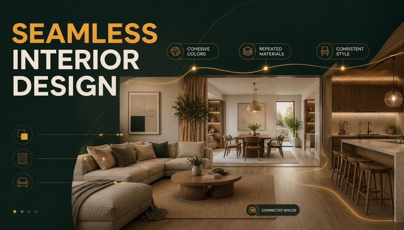
Seamless design is about what you remove rather than what you add. Fewer visual breaks, fewer transitions, fewer objects interrupting a surface — the result is a space that reads as larger, calmer, and more considered than the same room with everything visible.
It's also one of the most useful principles in property presentation, because visual breaks are exactly what makes rooms photograph as busy and cramped.
This covers what seamless design actually means in practice, the decisions that create it, and where the approach stops being useful.
What Seamless Design Means
The term gets used loosely. In practice it describes a set of related decisions, all aimed at reducing the number of visual interruptions in a space.
The Core Principle
Every visual break stops the eye. A threshold strip between rooms, a cabinet handle, a skirting board in a contrasting colour, a visible appliance — each one is a small stop.
Reduce the number of stops and the eye travels further, which is read as more space.
The Six Elements
- Continuous flooring — the same material running through connected spaces
- Flush and handleless surfaces — no protruding hardware
- Consistent palette — walls, trim, and doors in related tones
- Concealed storage — built in rather than freestanding
- Hidden or integrated services — appliances, radiators, switches
- Aligned lines — cabinet edges, door heights, and shelving lining up
Try DecoAI Free
3 free credits. No credit card needed. Stage any room in 30 seconds.
Get 3 Free Credits1. Continuous Flooring
The single highest-impact decision.
Why It Works
A threshold strip between a hallway and a living room creates a hard visual boundary. The eye reads two spaces. Run the same floor through both and the eye reads one larger space.
The effect is strongest in open-plan and connected areas where the change would otherwise happen in an open doorway.
How to Do It
Same material throughout the connected zone. Kitchen, dining, living, and hallway sharing one floor is the most common approach.
Run the boards in one direction. Changing direction between spaces recreates the break you removed.
Run boards along the longest dimension. In a rectangular space, boards running the long way emphasize the length.
Eliminate threshold strips. Where two materials genuinely have to meet — at a bathroom, for instance — use a flush transition rather than a raised strip.
Where It's Not Practical
Bathrooms, utility rooms, and any wet area usually need a different material. That's fine — the goal is continuity through the main living zones, not the whole property.
For Staging
If flooring is continuous, photograph in a way that shows it running through. A shot from a hallway into a living room with unbroken flooring communicates the connection better than two separate room shots.
2. Flush and Handleless Surfaces
Kitchens
Handleless cabinetry — push-to-open or with a recessed channel — removes dozens of small protrusions from the most hardware-dense room in a property.
The visual effect: cabinet fronts read as a continuous plane rather than a grid of doors with handles.
Options:
- Push-to-open mechanisms
- J-pull recessed channels
- Integrated finger pulls
- Slim horizontal channels between units
Wardrobes and Storage
The same principle. Handleless built-in wardrobes read as wall rather than as furniture, which makes bedrooms feel less crowded.
Doors
Flush doors — flat, no panelling — read as more seamless than panelled ones.
Concealed frames and flush-to-wall doors take this further, though they're an architectural change rather than a finish decision.
For Staging
Handleless surfaces photograph noticeably cleaner. In a staged kitchen image, cabinet fronts without handles produce a calmer result.
3. Consistent Palette
Walls, Trim and Doors in One Tone
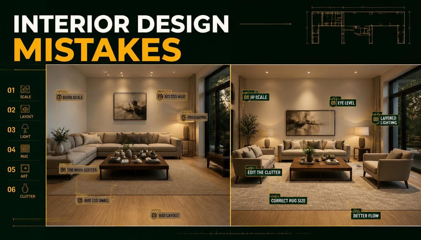
The conventional approach — white trim against coloured walls — creates a visible line at every skirting board, door frame, and window reveal.
Painting trim the same colour as the walls removes those lines entirely.
The effect: walls read as taller and rooms as larger, because the eye isn't being stopped at every junction.
Practical note: use different finishes rather than different colours. Matt on walls, eggshell or satin on trim, same colour. You keep the durability difference without the visual break.
Ceilings
Painting the ceiling the same colour as the walls, or a shade lighter, removes the horizontal line at the top of the wall.
Where it works: rooms with low ceilings, where the line makes the space feel compressed.
Where it doesn't: rooms with cornicing worth showing, and rooms where the ceiling is genuinely the brightest surface you want.
Radiators
Painting radiators to match the wall removes one of the most visually intrusive elements in most rooms.
Cost: $15–$25 in radiator paint. Effect: disproportionate to the cost.
Try DecoAI Free
3 free credits. No credit card needed. Stage any room in 30 seconds.
Get 3 Free Credits4. Concealed Storage
Built-In Over Freestanding
A freestanding wardrobe is an object in a room. A built-in wardrobe with flush doors is a wall.
The same logic applies to shelving, media units, and utility storage.
The effect on perceived space: substantial. Freestanding storage occupies floor and creates gaps behind and beside it. Built-in storage occupies none of the visible floor.
Under-Stair and Alcove Storage
Alcoves either side of a chimney breast are the most common opportunity. Built-in storage that runs floor to ceiling reads as architecture rather than furniture.
Where to Stop
Concealing everything produces a space with nowhere for the eye to rest and no sense of who lives there.
Practical balance: conceal utility and clutter, display a small number of chosen objects. Open shelving with three items reads as considered; open shelving with thirty reads as clutter.
5. Hidden and Integrated Services
Kitchen Appliances
Integrated appliances behind cabinet fronts remove the visual break of a stainless steel panel in a run of cabinetry.
The exceptions: range cookers and statement appliances that are intentionally on display. Those work when they're clearly deliberate.
Small Appliances
Toasters, kettles, and coffee machines on the counter break the horizontal line of the worktop.
Solutions:
- An appliance garage — a cupboard at counter level with a roller or bi-fold door
- A dedicated pantry cupboard
- Simply putting them away when not in use
For photography: clear every counter completely. This is the single biggest improvement available in most kitchen images.
Switches, Sockets and Vents
Match the finish to the wall. White sockets on white walls disappear. White sockets on a coloured wall don't.
Group them. Multiple switches in one plate rather than three separate plates.
Consider placement. Sockets at skirting level are less visible than at mid-wall height.
Cables
Visible cables are one of the most common failures in otherwise well-presented rooms.
For a TV: cable management behind the wall, or a channel run vertically down the wall and painted to match.
For lamps and devices: route behind furniture, use cable clips along skirting, or simply move things closer to sockets.
6. Aligned Lines
The most subtle element and the one that separates competent design from considered design.
What to Align
Door heights with cabinet heights. Where a door and a run of cabinetry share a wall, matching the top line removes a stagger.
Wall units with window heads. Kitchen wall cabinets ending at the same height as the top of a window reads as intentional.
Shelving with existing lines. Aligning a shelf with a door head or window sill rather than placing it arbitrarily.
Worktop with window sill. Where possible, a worktop level with a sill produces a continuous horizontal.
Why It Matters
Misaligned horizontals produce a low-level visual noise most people register without identifying. Aligned ones read as calm.
For Staging
When reviewing a staged image, check whether the generated furniture creates awkward stagger against the room's existing lines. A sideboard whose top edge sits slightly above or below a window sill reads worse than one that aligns or clearly differs.
Where Seamless Design Stops Working
Too Little Contrast
A space where every surface is the same tone and every edge is flush can read as flat and characterless.
The fix: texture rather than colour. Different materials at the same tone — wood against plaster against wool — provide variation without introducing visual breaks.
Losing Practical Function
Handleless cabinets can be harder to open. Fully integrated appliances are more expensive and harder to service. Concealed storage means less obvious storage, which some buyers count against you.
Period Properties
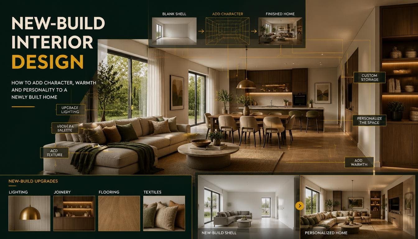
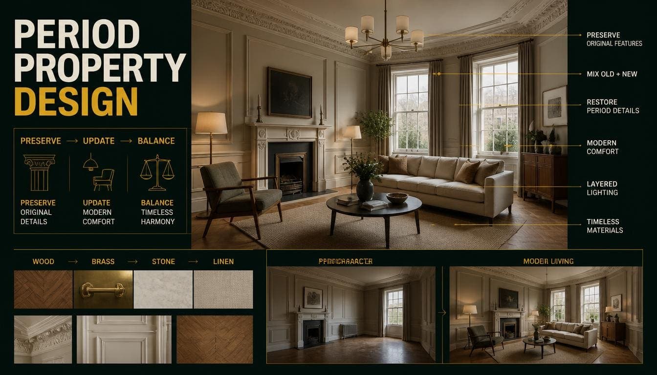
Cornicing, panelling, picture rails, and skirting detail are features worth showing in a period property. Painting them out to achieve seamlessness removes character buyers are paying for.
Very Small Rooms
Counter-intuitively, an entirely flush and toneless small room can feel like a box. Some definition helps rooms read as designed rather than blank.
Cost
Continuous flooring, handleless cabinetry, integrated appliances, and built-in storage are all more expensive than their conventional equivalents.
For a property you're selling: the low-cost elements — painting trim to match, painting radiators, clearing counters, managing cables — deliver most of the visual benefit. The expensive elements rarely return their cost.
The Low-Cost Version
If you want the effect without the renovation:
| Action | Cost | Effect |
|---|---|---|
| Paint trim same colour as walls | $40–$80 per room | High |
| Paint radiators to match | $15–$25 | High |
| Clear all counters completely | Free | High |
| Manage visible cables | $10–$20 | Moderate |
| Match socket and switch finish | $20–$60 | Moderate |
| Remove threshold strips where possible | $0–$30 | Moderate |
| Remove freestanding storage | Free | High |
Total: under $200 for most properties, and it addresses the majority of the visual breaks in a typical room.
Frequently Asked Questions
What is seamless interior design?
An approach that reduces visual breaks in a space — continuous flooring, handleless surfaces, consistent palettes, concealed storage, hidden services, and aligned lines. The result reads as larger and calmer.
Does continuous flooring make rooms look bigger?
Yes, noticeably. A threshold strip creates a visual boundary that makes the eye read two spaces. Continuous flooring makes it read one.
Should I paint skirting the same colour as the walls?
For a seamless effect, yes. Use the same colour in different finishes — matt on walls, eggshell on trim — to keep durability without the visual line.
Are handleless kitchens practical?
Push-to-open mechanisms work well but can be less intuitive. Recessed J-pull channels give the handleless look while remaining conventional to use.
Should I paint radiators?
Yes, to match the wall. It costs $15–$25 and removes one of the most visually intrusive elements in most rooms.
Does seamless design work in period properties?
Partially. Continuous flooring and clear surfaces work. Painting out cornicing, panelling, and detailed skirting removes character that buyers value.
What's the cheapest way to get a seamless look?
Paint trim to match the walls, paint radiators, clear all counters, manage cables, and remove freestanding storage. Under $200 for most properties.
Can a room be too seamless?
Yes. Entirely flush and toneless spaces can read as flat. Introduce variation through texture and material rather than through colour and edges.
Why do cables matter so much?
Visible cables are a small break that appears in almost every photograph and reads as unfinished. They're also among the cheapest things to fix.
Summary
The principle: every visual break stops the eye. Fewer breaks means the eye travels further, which reads as more space.
The six elements: continuous flooring, flush and handleless surfaces, consistent palette, concealed storage, hidden services, aligned lines.
The highest-impact decision: continuous flooring through connected spaces.
The cheapest high-impact decisions: paint trim to match the walls, paint radiators, clear counters completely, and manage cables. Under $200 total.
Where it stops: period properties with detail worth showing, very small rooms that need some definition, and any point where practicality suffers for the sake of a flush surface.
See the effect in a staged image. DecoAI gives 3 free credits with no card required — clear surfaces and continuous flooring produce noticeably cleaner staged results.