Luxury interior design is the easiest style to apply badly and the hardest to apply well — because unlike every other style, it makes a claim about the property itself.
Modern staging says "this room is clean." Scandinavian says "this room is calm." Luxury says "this property is expensive." If the property isn't, the claim collapses the moment someone walks through the door.
This guide covers what actually defines Luxury design, how to apply it, and — importantly — when not to.
What Luxury Design Actually Is
Luxury isn't a historical movement like Modern or a regional style like Scandinavian. It's a set of decisions oriented around a single goal: signalling quality.
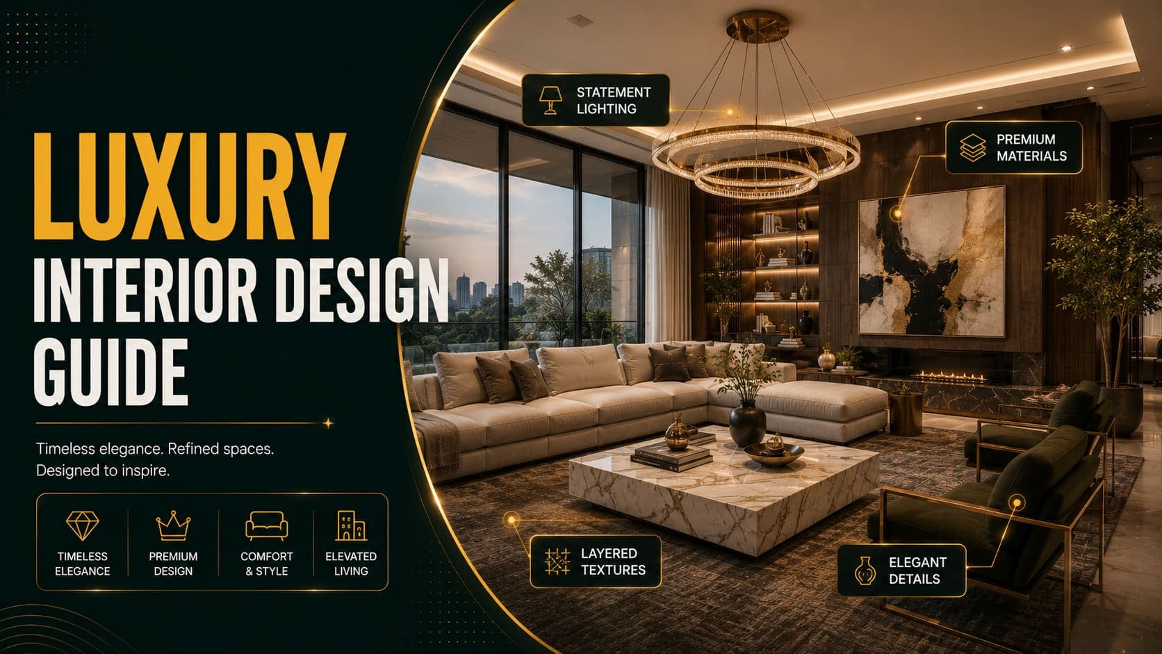
Core Characteristics
Material quality over quantity — Marble, brass, velvet, silk, solid hardwood. Fewer pieces, better materials.
Depth of colour — Where most styles use neutrals, Luxury uses saturated depth: navy, emerald, burgundy, charcoal.
Considered proportion — Furniture scaled generously. Ceiling height used. Nothing feels cramped or compromised.
Statement lighting — Chandeliers, sculptural pendants, sconces. Lighting is a design object, not just a function.
Layered texture — Velvet against marble against wool against brass. The richness comes from contrast between surfaces.
Symmetry and formality — More structured arrangements than Modern's function-driven placement.
Negative space as luxury — Uncrowded rooms signal that space itself is affordable.
Try DecoAI Free
3 free credits. No credit card needed. Stage any room in 30 seconds.
Get 3 Free CreditsThe Luxury Palette
Base Colours
- Deep navy — the most reliable luxury base, works across most properties
- Charcoal and near-black — for drama, best in rooms with strong natural light
- Emerald and forest green — currently prominent, pairs well with brass
- Warm ivory and cream — lighter luxury, better for smaller rooms
- Deep burgundy and oxblood — traditional luxury, more polarizing
Metallic Accents
- Brass — the dominant luxury metal in current design
- Antique gold — warmer, more traditional
- Polished nickel — cooler, more contemporary
- Avoid: Chrome, which reads as commercial rather than residential
Materials That Signal Quality
- Marble — Carrara, Calacatta, or dark options like Nero Marquina
- Velvet — the most recognizable luxury upholstery
- Silk and satin — in cushions and drapery
- Solid hardwood — walnut, oak, mahogany
- Natural stone — travertine, onyx as accents
What Undermines It
- Visible synthetic materials
- High-gloss laminate
- Excessive gold — one or two brass elements, not everything
- Overcrowding — the room should feel generous, not filled
Luxury by Room
Living Room
Furniture: Deep velvet sofa, two accent chairs, marble or stone coffee table, console table Palette: Navy or emerald walls, or deep neutrals with a saturated sofa Lighting: Statement chandelier or large sculptural pendant, plus table lamps Textiles: Large wool or silk rug, layered cushions in complementary tones Art: One large piece rather than a gallery wall
Bedroom
Furniture: Upholstered bed with a tall headboard, matching bedside tables, an upholstered bench at the foot Palette: Deep or muted rich tones — navy, sage, charcoal Bedding: Layered — sheets, a duvet, a throw, multiple pillows Lighting: Bedside sconces or table lamps with fabric shades Detail: Full-length drapery, floor to ceiling
The bench at the foot of the bed is one of the most recognizable luxury signals in bedroom staging.
Bathroom
Surfaces: Marble or stone, floor to ceiling where possible Fixtures: Brass or antique gold taps and hardware Detail: Freestanding bath if the space allows, large mirror, folded white towels Lighting: Sconces beside the mirror rather than an overhead fixture
Bathrooms carry luxury signalling more efficiently than most rooms — surface quality is immediately readable.
Kitchen
Cabinets: Deep colour — navy, green, charcoal — with brass hardware Worktops: Marble or high-quality quartz with visible veining Lighting: Statement pendants over an island Detail: Integrated appliances, minimal visible small appliances
Dining Room
Furniture: Large table in solid wood or marble, upholstered chairs Lighting: Chandelier centred over the table — this is the single strongest luxury signal in a dining room Detail: Sideboard, large mirror or artwork on one wall
Try DecoAI Free
3 free credits. No credit card needed. Stage any room in 30 seconds.
Get 3 Free CreditsWhen Luxury Staging Works
The Property Tier Matches
This is the only real prerequisite. Luxury staging works when the property genuinely sits in the premium band for its market.
What "premium" means varies enormously by location. The test isn't an absolute price — it's whether the property is in the top tier of its local market.
Strong Architectural Features
High ceilings, large windows, generous room proportions, quality existing finishes. Luxury staging amplifies these; it can't create them.
Buyers Expect It
In some markets and price bands, buyers expect a certain presentation standard. Under-presenting a premium property reads as under-marketing.
The Room Is Large Enough
Luxury furniture is generously proportioned. A deep velvet sofa and marble coffee table need space to work. In a compact room, they fill the frame and make it look smaller.
When Luxury Staging Fails
The Property Doesn't Match
This is the critical failure mode.
A budget or mid-range property staged Luxury creates a gap between the listing images and the viewing experience. Buyers arrive expecting one thing and find another, and the mismatch damages trust more than plain staging ever would.
The staging isn't the problem — the discrepancy is.
The Rooms Are Small
Luxury's generous proportions and deep colours both work against compact spaces. Dark walls absorb light; large furniture fills floor.
For small premium properties, Modern or Contemporary usually presents better than Luxury.
Limited Natural Light
Deep navy and charcoal need light to read as rich rather than gloomy. In a dim room, luxury palettes turn muddy.
The Market Is Practical Rather Than Aspirational
Some markets — particularly family-oriented suburban areas — respond better to comfort signals than status signals. Traditional or Contemporary often outperforms Luxury there even at higher price points.
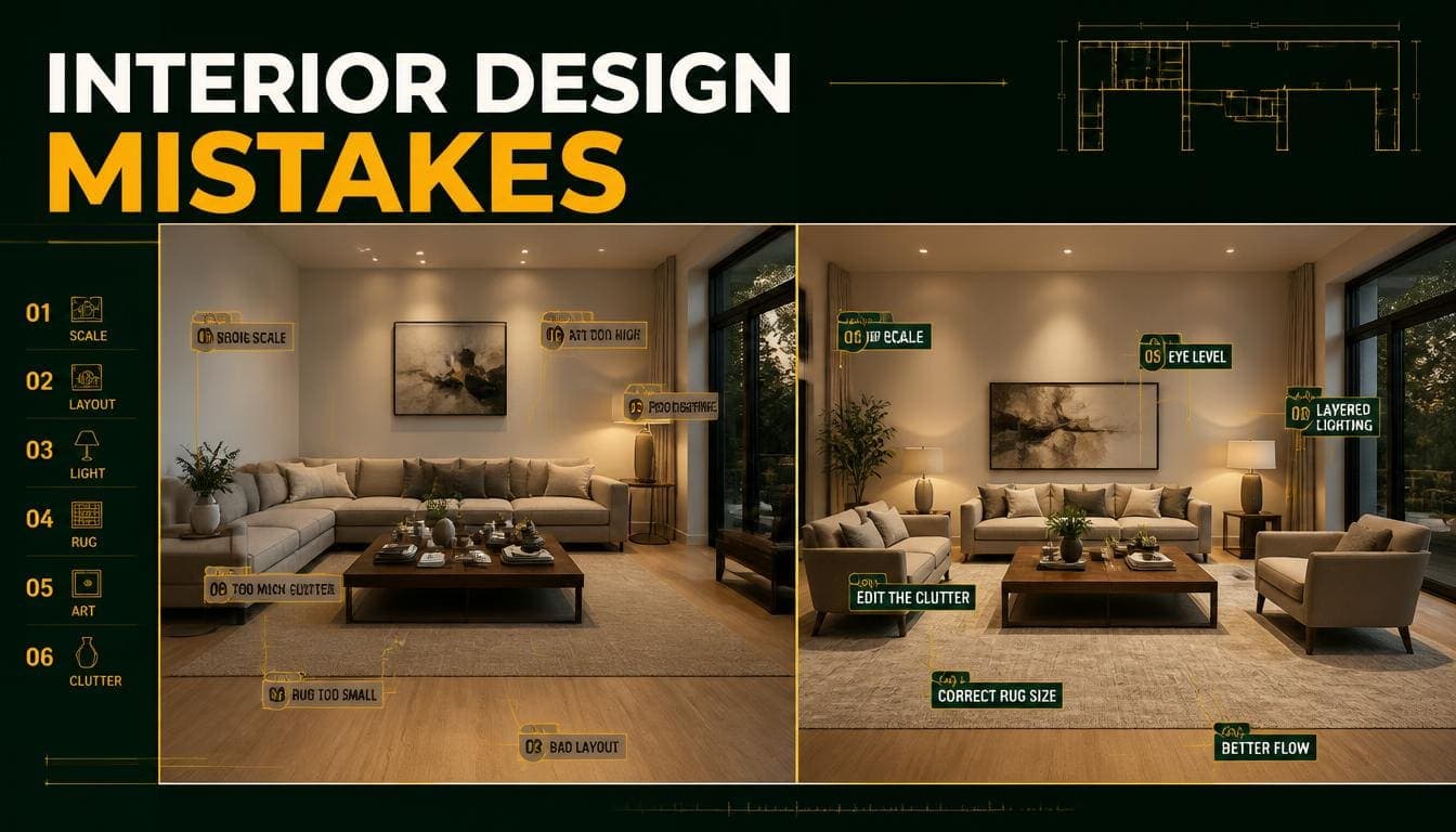
Common Luxury Design Mistakes
1. Applying It to the Wrong Property
The single most damaging error. Match the staging tier to the property tier.
2. Too Much Gold
One or two brass elements read as considered. Gold everywhere reads as costume.
3. Overcrowding
Luxury is partly about space being affordable. Filling every corner with expensive-looking furniture undermines the effect.
4. Dark Colours in Dim Rooms
Navy and charcoal need light. Without it they read as heavy rather than rich.
5. Visible Synthetic Materials
A velvet-look polyester sofa in a luxury staging reads immediately as an imitation. In digital staging this matters less, but the aesthetic should still suggest genuine materials.
6. Mismatched Formality
A formal luxury living room next to a casual contemporary kitchen creates a tonal inconsistency across the property.
7. Ignoring the Ceiling
Luxury design uses vertical space — full-height drapery, tall headboards, statement lighting hung generously low. Ignoring the ceiling wastes the property's proportions.
Luxury on a Smaller Scale
For properties that are premium but compact, a lighter interpretation works better:
Palette: Warm ivory and cream rather than deep navy Furniture: Well-proportioned but not oversized Metals: Brass, but sparingly Materials: Marble in smaller applications — a side table rather than a full worktop Lighting: A single elegant pendant rather than a large chandelier
This reads as considered quality without the bulk that makes small rooms feel smaller.
Frequently Asked Questions
What is luxury interior design?
A style oriented around signalling quality through material choice — marble, brass, velvet, solid hardwood — combined with saturated colours, generous proportions, and statement lighting.
What colours are used in luxury interior design?
Deep navy, emerald, charcoal, burgundy, and warm ivory as bases. Brass and antique gold as metallic accents.
What makes a room look expensive?
Material quality over quantity, deep saturated colour, generous furniture proportions, statement lighting, full-height drapery, and uncrowded space.
When should I use luxury staging?
Only when the property genuinely sits in the premium tier for its local market. Applying it to mid-range properties creates a mismatch buyers notice at the viewing.
Does luxury staging work in small rooms?
Poorly, in its full form. Deep colours and generously proportioned furniture both work against compact spaces. A lighter interpretation — ivory palette, smaller-scale pieces, minimal brass — works better.
What's the most recognizable luxury signal in staging?
A chandelier over a dining table, and an upholstered bench at the foot of a bed. Both read as luxury immediately.
Is gold or brass better for luxury interiors?
Brass currently dominates and reads as more contemporary. Antique gold is warmer and more traditional. Chrome should generally be avoided — it reads commercial.
Can luxury staging backfire?
Yes, and it's the style most likely to. If the property doesn't match the staging, the gap between listing expectation and viewing reality damages buyer trust.
What's a safer alternative to luxury staging?
Modern or Contemporary. Both present well at premium price points without making a claim the property might not support.
Summary
Luxury design signals quality through materials, colour depth, proportion, and restraint — not through adding expensive-looking things.
Use it when: The property genuinely sits in the top tier of its local market, the rooms are large, the light is good, and buyers in that band expect it.
Skip it when: The property is mid-range, the rooms are compact, the light is limited, or the market values comfort over status.
The rule that matters most: match the staging tier to the property tier. Under-staging a premium property is a missed opportunity. Over-staging a modest one is a credibility problem.
See whether Luxury suits your property. DecoAI gives 3 free credits with no card required — enough to compare Luxury against Modern and Contemporary and judge which the space actually supports.